The Page Editor is where the designer can create the desired Page, with the features and layout they need.
Screen Layout
The Design tab of the Page Editor has three areas:
| Properties Panel Hidden |
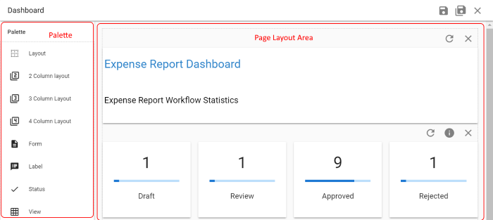 |
| Properties Panel Shown |
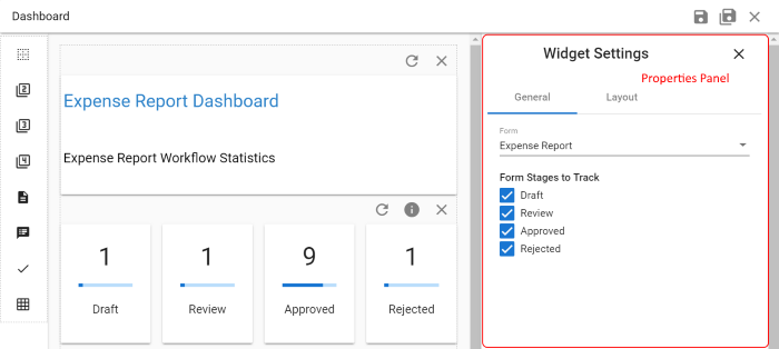 |
| Name | Location | Purpose |
| Palette | Left Side | The palette is the list of layout components and page controls that can be placed onto the page.
When the Properties Panel is displayed, the Palette is made narrower and only shows the icons for the layout component and fields. |
| Page Layout Area | Middle | This is where the form you are designing is built and displayed. Fields are dragged from the Palette and dropped on the Form Layout Area to created the design of the form. |
| Properties Panel | Right Side | This is where all the settings for the controls can be adjusted.
The Properties Panel only displays when it is activated. When you first open a page only the Palette and Page Layout Area are shown. The Properties Panel displays when the designer clicks on the properties icon for the component. |
Page Design Basics
You create your page by finding the desired widget on the palette on the left side of the screen, then just drag & drop it onto the desired location on the page. You can also drag & drop existing components within the page to change its layout. There are also components that allow you to choose one, two three or four column layout areas, a bit like putting things in a table in a document so they stay where you want them to.
| Drag & Drop Page Design |
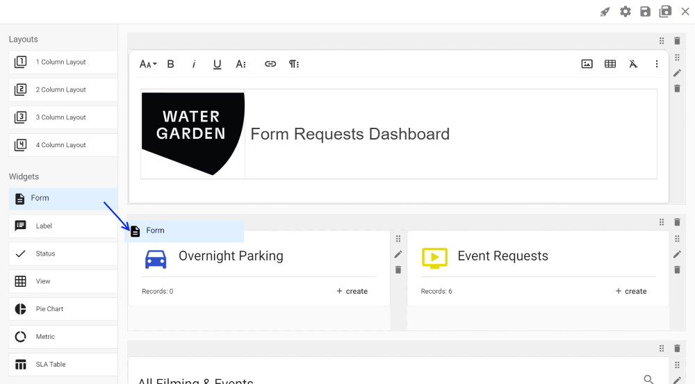 |
You can then change the settings for a component by typing them directly on the field or via the properties panel on the right side. (Click on the pencil (Edit) icon on the right side of the component to open the Properties Panel.)