Widgets add both functionality and aesthetics to Pages. This article provides detailed information about the settings & properties of each widget in the order they appear in the Page Editor.
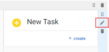
The Widget Settings panel can be opened for any widget by clicking on the pencil (Edit) icon on the right side of the component after it is added to a Page.
Form Widget
The Form Widget adds a link to a form in your app, providing app users with access to the application’s forms directly from a Page. After adding this widget to a page, clicking the ‘+ create’ button on the widget card opens a new blank form.
| Setting | Description |
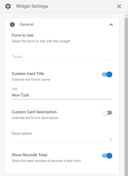
| Form to Use | When first adding the widget to a page, you select the form the widget links to. The ‘Form to Use’ section simply displays the Form selected/linked. |
| Custom Card Title | Enabling this option allows you to edit the Card Title. By default, the Card Title is the name of the Form it is linked to. |
| Custom Card Description | Enabling this option allows you to enter a custom description which will display below the Card Title. |
| Show Records Total | When this option is enabled, the total number of records for the associated form will display on the bottom left corner of the widget. |
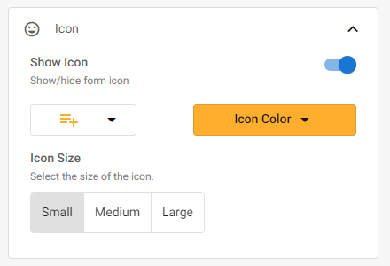
| Show Icon | Optionally display an Icon to the left of the Card Title. You may select the Icon and the Color. |
| Icon Size | The display size of the Icon. |
Label Widget
The Label Widget allows you to add and display formatted text, tables, images and links on your Page.
| Setting | Description |
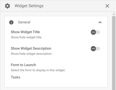
| Show Widget Title | Optionally display a custom title above the widget. After enabling this option, a text box will appear where you can enter a title. |
| Show Widget Description | Optionally display a custom description above the widget and under the title (if enabled). After enabling this option, a text box will appear where you can enter a description. |
| Background | Enabling this option allows you to change the background color of the Label. |
Status Widget
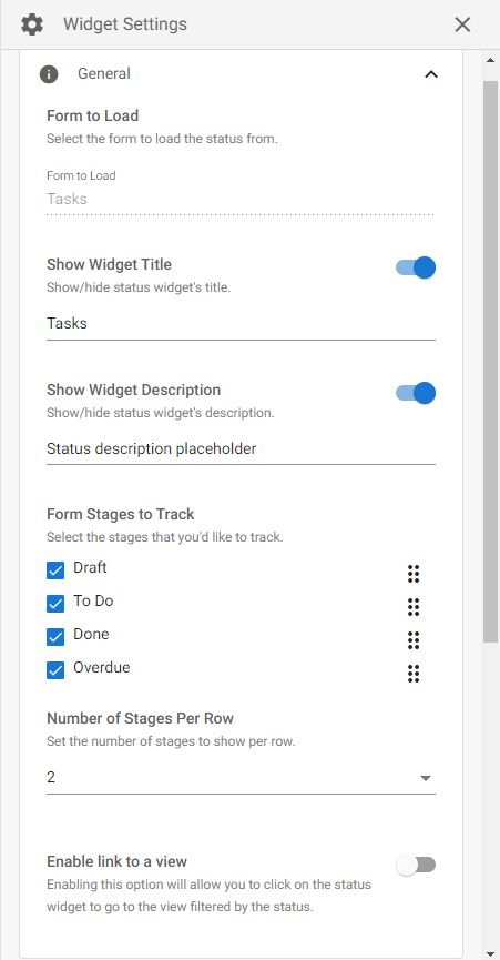
The Status Widget allows you to display the number of records in specified stages of a form’s workflow. When first adding the widget to a page, a dialog box will appear where you must select the reference form, and then you may select which stages to display.
| Setting | Description |
| Form to Load | When first adding the widget to a page you choose the reference form. The ‘Form to Load’ section simply displays the Form selected/linked. |
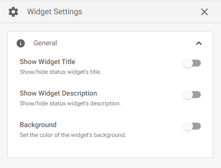
| Show Widget Title | Optionally display a custom title above the widget. After enabling this option, a text box will appear where you can enter a title. |
| Show Widget Description | Optionally display a custom description above the widget and under the title (if enabled). After enabling this option, a text box will appear where you can enter a description. |
| Form Stages to Track | The workflow stages to track with the widget. The 6-dots icon on the right of each stage can be used to change the display order of the stages. |
| Number of Stages Per Row | Set the number of stage cards to show in a single row. This option is influenced by the column layout it is placed in. For example, if this widget is placed in a 4-column layout, the maximum number of Stages Per Row is 2. |
| Enable link to a view | Enabling this option will allow users to click on a stage in the widget and be redirected to a specified view. The view will be temporarily filtered to only show records that are in the stage the user clicks. |
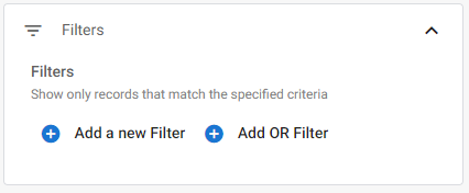
| Filters | Optionally filter the widget to only display records which meet the specified criteria. |
| Setting | Description |
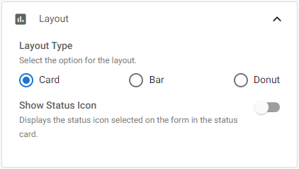
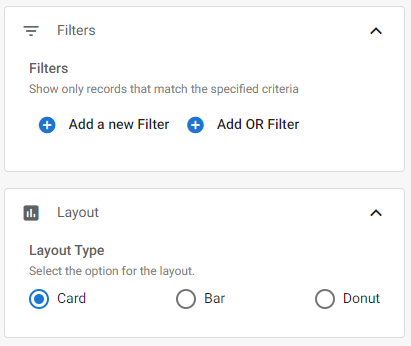
| Layout Type | The visual style of the widget. |
| Show Status Icon | Optionally display the stage icons in the widget. This option is only available for the ‘Card’ layout type. Stage icons are chosen during stage creation (in the Workflow Editor). |
View Widget
The View Widget allows you to embed one of your application views on a Page. Within the page, the view maintains its visual appearance and most of its settings. However, if the view has the ‘Preview Pane’ setting enabled, the embedded view will not open records in a preview pane (instead, it will redirect to viewing the record).
| Setting | Description |
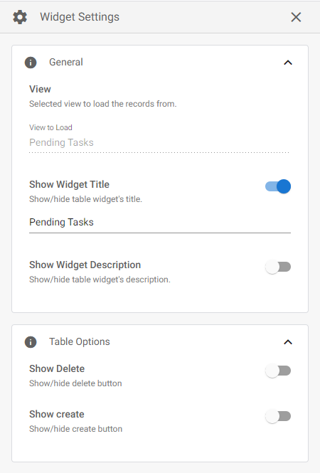
| View (View to Load) | When first adding the widget to a page you choose the reference View. The ‘View to Load’ section simply displays the View selected/linked. |
| Show Widget Title | Optionally display a custom title above the widget. After enabling this option, a text box will appear where you can enter a title. |
| Show Widget Description | Optionally display a custom description above the widget and under the title (if enabled). After enabling this option, a text box will appear where you can enter a description. |
| Show Delete | Whether or not to display the ‘Delete’ button in the embedded view. If this option is not enabled, users will not be able to delete records directly from the embedded view. Permission settings still apply, meaning that if the ‘Delete’ button is enabled, members of a role that does not have permission to delete records will still not be able to delete records. |
| Show Create | Adds a ‘+’ icon to the top of the widget which redirects to the form associated with the view, allowing users to create a new record. Permission settings still apply. |
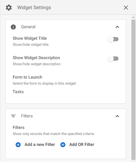
Pie Chart Widget
The Pie Chart Widget allows you to display form data in a Pie or Donut Chart style report. When adding this widget to a page, you must select the Form and the field on that Form that you want to report on.
| Setting | Description |
| Show Widget Title | Optionally display a custom title above the widget. After enabling this option, a text box will appear where you can enter a title. |
| Show Widget Description | Optionally display a custom description above the widget and under the title (if enabled). After enabling this option, a text box will appear where you can enter a description. |
| Form to Launch | When first adding the widget to a page you choose the reference form. The ‘Form to Launch’ section simply displays the Form selected/linked. |
| Filters | Optionally filter the widget to only display records which meet the specified criteria. |
| Setting | Description |
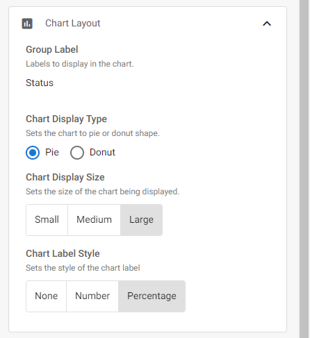
| Group Label | When first adding the widget to a page you choose the reference field on the Form. The Group Label section simply displays the field selected/linked. |
| Chart Display Type | Choose the visual style of the widget. |
| Chart Display Size | The display size of the widget on the Page. |
| Chart Label Style | Optionally display the sum or percentage of records in each grouping. For example, if you select the ‘Status’ field of a form and set the label style to ‘Number’, the widget will display the total number of records in each ‘Status’. |
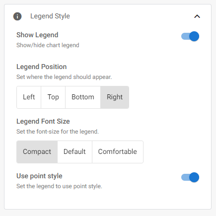
| Show Legend | Optionally display the Chart legend. For example, if you select the ‘Status’ field of a form, the legend will display the ‘Status’ names next to their associated color. |
| Legend Position | Where on the widget to display the legend. |
| Legend Font Size | The font size of the legend. |
| Use point style | Changes the legend icons from a rectangle shape to a circle (or point) shape. |
Bar Chart Widget
The Bar Chart Widget allows you to display datasets in a bar or line style report. When adding this widget to Page, you must select the Form to reference and the ‘Label Field,’ i.e., the field that will serve as the Chart’s X-axis.
| Setting | Description |
| Show Widget Title | Optionally display a custom title above the widget. After enabling this option, a text box will appear where you can enter a title. |
| Show Widget Description | Optionally display a custom description above the widget and under the title (if enabled). After enabling this option, a text box will appear where you can enter a description. |
| Form to Launch | When first adding the widget to a page you choose the reference form. The ‘Form to Launch’ section simply displays the Form selected/linked. |
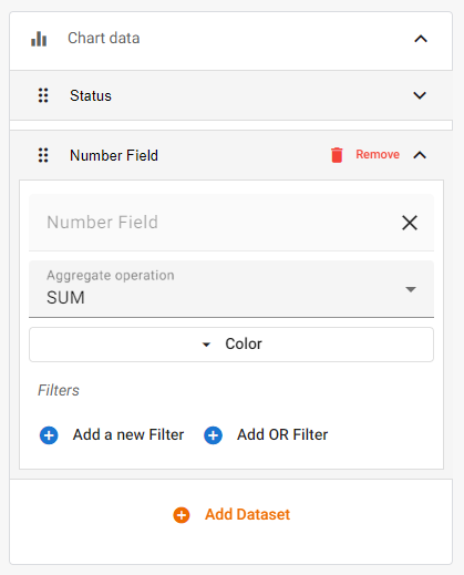
The ‘Chart Data‘ section is where you choose which dataset(s) to display on the Chart. Datasets are based on your Form fields. There are two datasets in the image above: one based on the ‘Status’ system field, and another based on a ‘Number Field.’
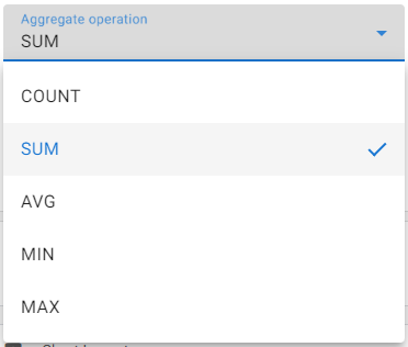
For Number and Currency fields, you must choose the ‘Aggregate operation‘ you wish to perform on the dataset. You may also customize the display color for the dataset, and add any additional filtering.
| Setting | Description |
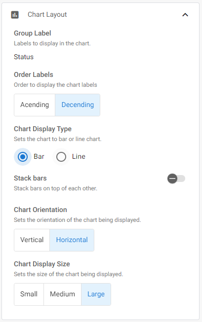
| Group Label | Displays the ‘Label Field’ (X-axis) selected when first adding the widget to the page. This cannot be changed once selected. |
| Order Labels | The order to display the chart labels (X-axis labels). |
| Chart Display Type | There are two Chart styles for this widget: Bar, and Line. |
| Stack Bars | If the Bar style report is selected, this option will stack the datasets on top of one another instead of next to each other. |
| Chart Orientation | Orients the Chart vertically or horizontally. |
| Chart Display Size | Controls the display size of the widget. |
For the ‘Legend Style‘ section, see here.
Metric Widget
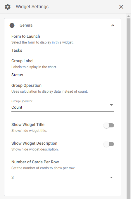
The Metric Widget displays a metric report of your data. When adding this widget to Page, you must select the Form to reference and the Field from that form that you want to report on.
| Setting | Description |
| Form to Launch | When first adding the widget to a page you choose the reference form. The ‘Form to Launch’ section simply displays the Form selected/linked. This cannot be changed once selected. |
| Group Label | Displays the Field selected when first adding the widget to the page (i.e., the Field being reported on). This cannot be changed once selected. |
| Group Operation | The operation to apply to the Field data. By default, the widget uses the record count. Other operations use calculations. |
| Show Widget Title | Optionally display a custom title above the widget. After enabling this option, a text box will appear where you can enter a title. |
| Show Widget Description | Optionally display a custom description above the widget and under the title (if enabled). After enabling this option, a text box will appear where you can enter a description. |
| Number of Cards Per Row | Set the number of cards to show in a single row. This option is influenced by the Column Layout. For example, if this widget is placed in a 4-column layout, the maximum number of Cards Per Row is 2. |
| Setting | Description |
| Filters | Optionally filter the widget to only display records which meet the specified criteria. |
| Layout | Choose the visual style of the widget. |
SLA Table Widget
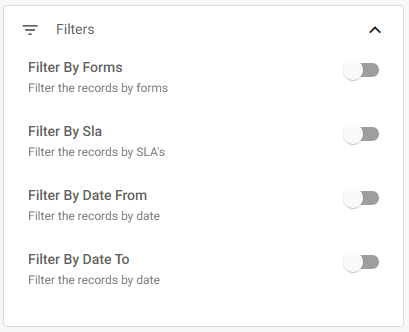
The SLA Table Widget displays SLA data from your app. The widget can be filtered to display specific SLAs.
| Setting | Description |
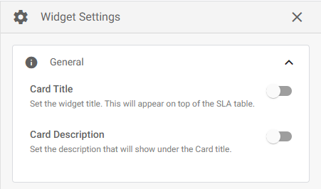
| Card Title | Optionally add a custom title to the widget. The title will display above the widget. |
| Card Description | Optionally add a custom description to the widget. The description will display above the widget and under the title (if enabled). |
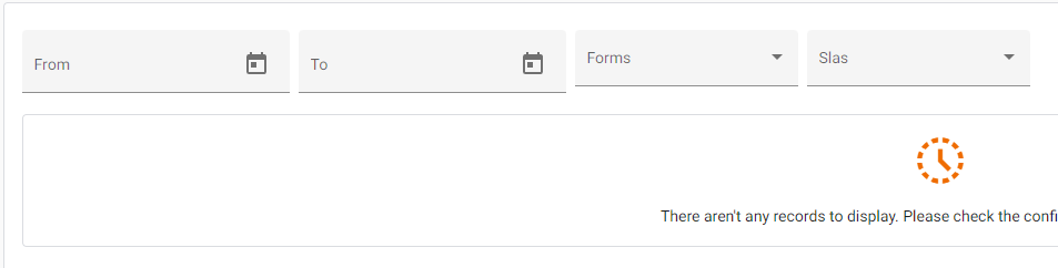
The ‘Filters’ section is used to filter the SLA Table. The settings you configure here will determine the initial state of the table. However, you can easily modify these filters in-app directly from the widget header bar (see image below).
| Setting | Description |
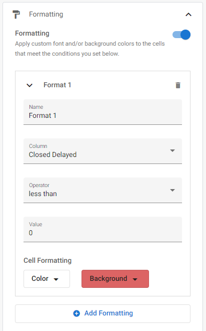
| Formatting | The Formatting section lets you add custom conditional formatting to the widget. When enabled, the ‘+ Add Formatting’ button will appear where you can add any number of conditional formatting rules. |
| Name | A name for the formatting rule. |
| Column | Which column will receive the formatting. |
| Operator | The condition to apply to the value. |
| Value | The value to check the condition against. |
| Color | The color of the text if the condition is met. |
| Background | The cell background color if the condition is met. |
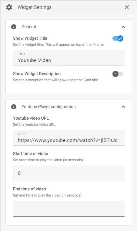
YouTube Player Widget
The YouTube Player Widget lets you embed a YouTube video on your Page. When adding this widget to Page, a dialog box will appear where you must add the URL link to the YouTube video.
| Setting | Description |
| Show Widget Title | Optionally display a custom title above the widget. After enabling this option, a text box will appear where you can enter a title. |
| Show Widget Description | Optionally display a custom description above the widget and below the title (if enabled). After enabling this option, a text box will appear where you can enter a description. |
| Youtube Video URL | The URL of the YouTube video. |
| Start time of video | Set the start time of the video (in seconds) when it is first played. Users will still be able to seek any timestamp within the video. |
| End time of video | Set the end time of the video (in seconds) when it is first played. The video will end when it reaches this timestamp. Users will still be able to replay the video and seek any timestamp within the video. |
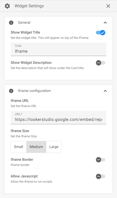
iFrame Widget
The iFrame (inline frame) Widget is used to embed and display a web page on your app Page. When adding this widget to Page, a dialog box will appear where you must add the URL link to the web page.
| Setting | Description |
| Show Widget Title | Optionally display a custom title above the widget. After enabling this option, a text box will appear where you can enter a title. |
| Show Widget Description | Optionally display a custom description above the widget and under the title (if enabled). After enabling this option, a text box will appear where you can enter a description. |
| Iframe URL | The URL of the web page you want to display. |
| Iframe Size | The display size of the embedded web page. |
| Iframe Border | Optionally add a border around the embedded web page. After enabling this option you can choose the Border Width (in pixels) and Color. |
| Allow Javascript | Toggle to allow the iFrame to run scripts. |