
An Attachment field allows you to select and attach one or more files, similar to attachment files in an email except that they stay associated with this specific field. You can add as many attachment fields as you need, and each field’s attachments stay associated with the field they were attached to. (Email attachments tend to be shown at the top or bottom of the email).
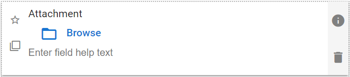
| The default look of the Attachment component |
 |
Attachment Field Properties
| Ajustes | Descripción |
| Pestaña básica / Configuración general | |
| Nombre visible Texto de ayuda de campo Requerido |
Ver Características Generales del Campo |
| Nombre del botón | Te permite cambiar el texto que se muestra junto al icono de la carpeta, donde el usuario hace clic para adjuntar un archivo. El valor predeterminado es “Explorar”, como se muestra en la captura de pantalla anterior. |
| Validations Tab / Upload Settings | |
| Max File Size | Select from a range of maximum allowed attachment size, from 0.1 MB to 100 MB. |
| Message to show users | El mensaje que se mostrará si el archivo que se está adjuntando es más grande que el valor de Tamaño máximo de archivo. |
| Allow Multiple Attachments | Enable if you would like the attachment control to be able to store more than one attachment. |
| Allow user to enter description for each upload | Enable if you would like the option of adding a text description to each attachment added to this field. This might help users find the correct attachment if multiple files are attached, or if there are multiple kinds of files that might be attached in a specific app. |
| Validations Tab / Upload Settings | |
| Message to display if non-allowed file type is uploaded | The message to display if the file being attached is not on the approved list of attachment file types. |
| Select the file types you will allow users to attach to this field. | |
| Pestaña avanzada / Visibilidad condicional – Ve Visibilidad condicional | |
Ejemplo de uso
| Attachment Usage Example – with optional descriptions |
 |
 English
  Spanish
  Italian