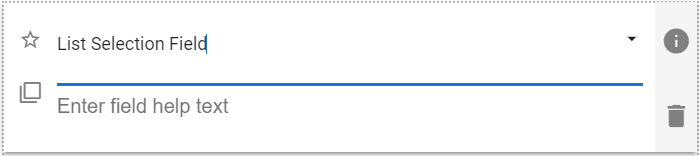
The List Selection field allows the user to select one or more entries from a list of options that appears once the field is selected.
| The default look of the List Selection component. |
 |
List Selection Field Properties
The properties panel allows the App Designer to further customize how the list options will be presented to the user.
| Setting | Description |
| Basic Tab / General Settings | |
| Display Name Field Help Text Required |
See General Field Features |
| Options Tab | |
| Allow Multiple Selections | Defines if this List Selection field will allow the selection of more than one value. |
| Sorting direction | Select None, Asc (Ascending) or Desc (Descending). Note: All values are treated as text when sorting. Also, selecting None after using the sort options will leave the options in the last sorted order, though they can then be manually reordered. |
| Advanced Tab / Conditional Visibility – Conditional Visibility | |
Setting Option Values
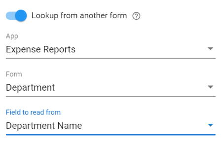
The option values for the List Selection can only be set in the properties panel. There are two ways to set the available options for a list selection field. The values can be manually entered directly, like Radio Button and Checkbox fields, or they can be looked up from the records associated with any form in GWApps that the users have access to.
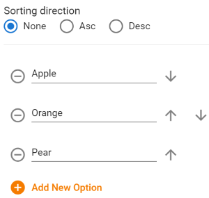
Manual Option Values
| Editing manual option values in the Properties panel |
 |
| Setting | Description |
| Option Text | Type the desired text or edit an existing value. Acts like a normal text field. |
 |
Delete this option. |
  |
Reorder the current option by moving it up or down the option list. Only available when using the Properties panel.
Note: The top and bottom options only have a single arrow, a down and an up respectively. When Asc or Desc sorting is selected the reordering arrows do not display. |
 |
Adds a new option at the bottom of the list.
Note: If Asc or Desc sorting is selected, the new option will be created wherever “Option ?”, where “?” is the number of the option, would sort in the list. |
List Selection Field Lookup Option Values
| Editing manual option values in the Properties panel |
 |
| Setting | Description |
| App | Select the desired GWApps app. Make sure the normal users of the application will have access to this app, or the lookup may fail for your users. |
| Form | Select the form from within the selected app whose records you want to lookup. |
| Field to read from | The name of the field on the lookup form whose values you would like to be the options available in the List Selection field. |
| Lookup Filters | Allows to you to filter which records will be displayed in the Multi Lookup selection list. For example, only showing Service Reps that work in the same state as listed in the “Customer Location State” field on the same record.
See Form Fields & Components: Lookup Filters for more details on setting a lookup filter. |
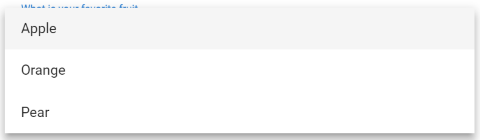
Usage Example
| List Selection Usage Example |
 |
Demonstration Video
The following video outlines creating radio button, checkbox and list selection fields: