The Form Editor Field Properties allow you to customize individual fields to better suit your specific needs, and improve the efficiency and clarity of your forms.
Common Field Properties
After dragging a field on to the Form Editor layout area you will see several different options within the field. The Field Title and Field Help Text properties can be set directly from the form layout area.

Field Title appears above the field. It lets the user know what information should be in the field, for example ‘First Name’ or ‘Date of purchase’. You can edit this value directly; simply click on the text to edit it. Or, you may also edit this in the Field Properties (in the General section of the Basic Tab). The default title will be the name of the component, e.g., ‘Text Field’, or ‘Date Field’.
Note: It’s possible to leave the field title blank. However, the field will have no title in your views unless you override the title in the field settings in the view editor.
Help Text appears under the field. It allows you to add any necessary additional information, e.g., directions, clarification, or an example of the correct format (“Enter employee ID in the following format ‘A – 1234’). You can edit this value directly; simply click on the text to edit it. Or, you may also edit this in the Field Properties (in the General section of the Basic Tab). There is no default help text and it will be blank unless you edit it.
Field Icons
 | Click on this icon to set the field as ‘Required’, meaning the record cannot be saved without a value filled in. |
 | Click on this icon to create a duplicate copy of the current field. The new field will appear below the current field in the same column container. |
 | Click on this icon for more in-depth field properties, displayed in a right-side properties panel. |
 | Click on this icon to delete the field from the form. |
Field Properties
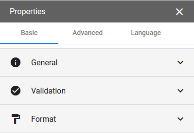
All field properties can be found by clicking on a the Properties icon within the field and going to the properties panel on the right side of the screen.
| Click on this icon in the field to open the field properties. |
For most fields, there are three tabs in the properties panel: Basic, Advanced, and Language. However, several fields also have a tab called Options with additional field specific properties.
Basic Tab
Most fields will have two to three sections in the Basic Tab. The most common by far are General, Validation, and Format.
The State and Country fields have a section called Selection which simply lets you choose whether or not to allow multiple selections.
The Table field has a section called Table Properties where you can specify properties for the table view.
General
The General section has a set of properties that exist on nearly all components.
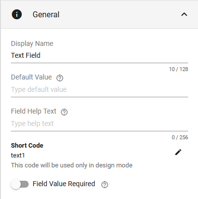
- Display Name is the Field Title.
- Default Value is the initial value to populate this field with each time a new record is created using this form.
- Field Help Text.
- Short Code is a short alias or nickname for the field. It is used when referring to the field in formulas. It can be edited by clicking on the pencil icon.
- Field Value Required. After you make a field required, you may set the message to show users when the field is left empty.
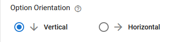
The Radio Button and Checkbox fields have an additional property which determines how the options will display.
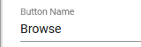
The Drive Picker and Attachment fields have a Button Name property, instead of a Default Value property.
Attachment Field
The Attachment field has a few extra general properties.
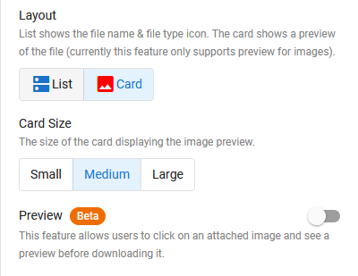
After choosing the Card Layout you can choose the Card Size.
Preview allows users to view an attached image in window overlay by clicking on it.
Validation
The Validation properties let you choose conditions that determine whether or not the input data is valid for the field. These properties are often unique to the field type. However, there are a few common properties.
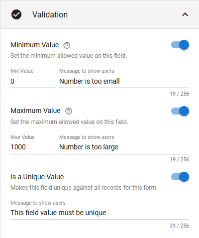
Many fields have three validation properties in common.
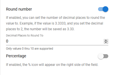
- Minimum and Maximum Value OR Minimum and Maximum Allowed Characters allows you to set the minimum and maximum values/characters for the field, and also lets you write a custom message for invalid values, or an improper length.
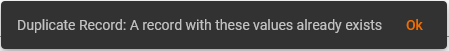
- Is a Unique Value makes it so you cannot have multiple records with the same value in this field. For example, if this is turned on for a Number field, and I put the number ‘1’ in this field and save the record, when I go to create a new record I cannot have ‘1’ in this field. If you try to save the record, this message will pop up:
Text Field
In addition to the three properties above, Text fields have another validation property called Pattern.
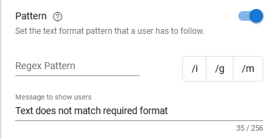
Pattern allows you to set a required format for your text fields using Regular Expressions. You can learn more about Regular Expressions here. You may also use regex101 to help you build and test expressions before using them on your forms.
Date Field
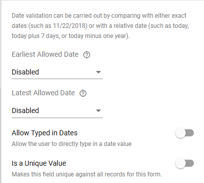
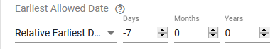
When choosing an Earliest or Latest Allowed Date, you must select either an Exact Date or Relative Date.
- Relative Date is relative to the day the record is being created.
Allow Typed in Dates gives users the ability to type in a date. By default, the user can only choose a date from a pop-up calendar.
A couple accepted typed formats:
- mm/dd/yyyy
- ‘June 6 2021’ or ‘6 June 2021’
 | With Allow Typed in Dates turned on, users may still select from a pop-up calendar by selecting this icon in the field. |
Time Field
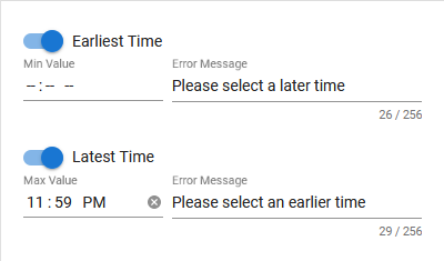
Similar to a Date field, you may select an Earliest and Latest Time, and also customize the error message.
Phone Field
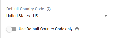
Default Country Code will determine the default country code for the field when creating a new record. The country code can still be changed by the user.
User Default Country Code only disables the ability for the user to change the country code.
Checkbox Field
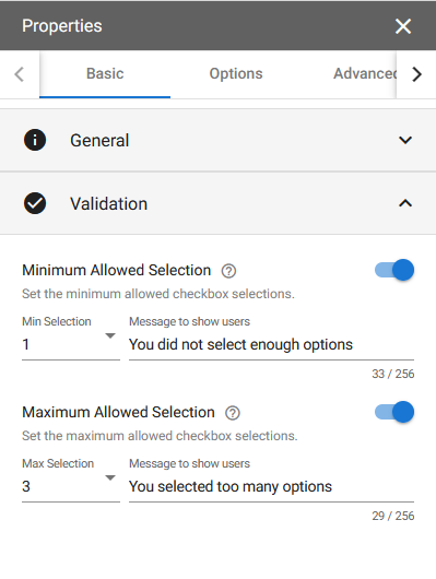
Minimum / Maximum Allowed Selection determines the selection constraints for the checkbox field options. You may also add a custom message to show users when the constraints aren’t met.
Attachment Field
| Note: The attachment field validation properties are found in a separate tab titled Validations. |
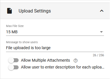
Max File Size determines the file size limit. You may then customize the message users will see when they exceed the limitation.
Allow Multiple Attachments to allow more than one file attachment to be uploaded to this Attachment field. Only a single file can be uploaded to this field if this option is not enabled.
Allow user to enter description for each upload lets users put a description on their attachments.
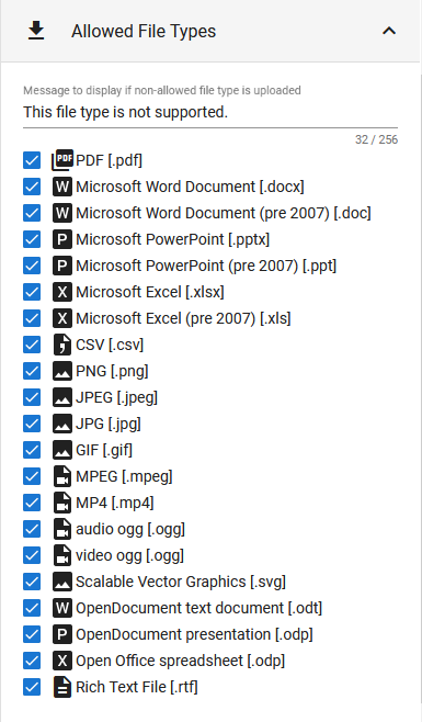
You may also choose which files types to accept as attachments, and customize the message for unsupported files.
Format
Some fields have Format properties. These set specific, fixed formatting for your fields, and are unique to the field type.
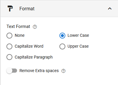
These properties only affect input data, not the Field Title or Help Text. In the example above, all user input in this text field will be forced Lower Case.
Advanced Tab
The Advanced tab has four main sections: Conditional Visibility, Concatenation, Formula, and Rules. The Attachment field also has a unique section called Upload to Drive.
Every field has Conditional Visibility and Rules. The other two, Concatenation and Formula, are specific to text and number type fields, respectively.
Conditional Visibility
This property lets you hide or show a field or section based on the value(s) of other fields.
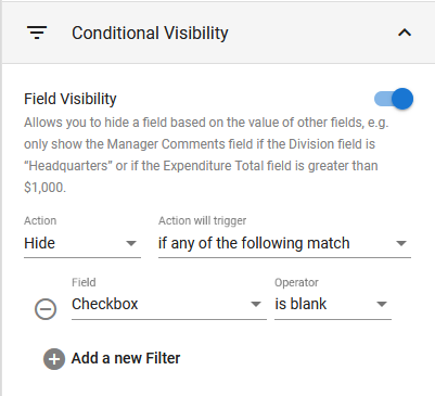
Hide is currently the only available Action. It will hide the field if the conditions are met.
Action will trigger determines how to check the condition(s). There are two options:
- If any of the following match means the action will be triggered if any of the conditions are met.
- If all of the following match means the action will be triggered if all of the conditions are met at the same time.
Field is the field to check the condition against.
Operator is the condition that must be true for the Field. The Operators change depending on the type of field you choose. You can find a list of operators here.
Depending on the field and operator you choose, a Value section may appear where you can enter a value to compare the field contents against.
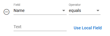
When you click on Use Local Field the Value field is replaced by a drop-down menu of all fields on your form that can be used to check the Field against.
After selecting Use Local Field, a Use Value button will take its place which will return it to a Value.
 | Select this icon to remove a condition. |
Conditional Validation
This property enables you to dynamically adjust a field’s validation rules, such as making the field required or not, based on the values of other fields.
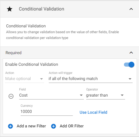
The ‘Action’ will always be the inverse of the field’s current validation setting. For example, if the field is ‘Required’ by default, the ‘Action’ will be ‘Make optional’, meaning if the conditions are met the field will be changed to optional.
See the previous section (Conditional Visibility) for details on the filters.
Concatenation
As mentioned above, Concatenation properties are available for text type fields. This property lets you populate a field with the combined values of other fields. Users cannot edit a concatenated field directly, except by filling out the accompanying fields.
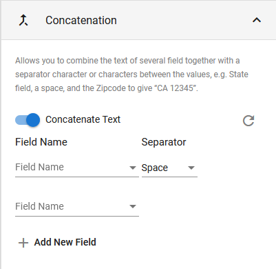
Field Name will have a list of fields currently on your form. Select a field from the drop-down to con, and there is also the option for Custom text.
Separator options include Space, Underscore _, Dash –, and Custom.
You may keep adding fields with the ‘+ Add New Field‘ button. After adding a field, an ‘X’ will display to the right of it. Clicking the ‘X’ will remove the field.
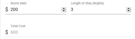
Formula
Formula properties are available for number type fields, and it allows you to create a formula and populate the field with the results. Like the Concatenation section, users cannot directly edit a field that is using a formula, except by filling out the accompanying fields.
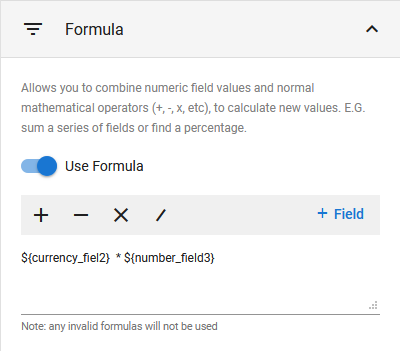
Click a mathematical operator on the gray bar to add the operator to the formula.
Click ‘+ Field‘ to select an appropriate field from your form to add to the formula.
You may also type directly in the text area. Remember that a fields Short Code is used for formulas.
Rules
Rules allow you to perform automated actions such as filling, clearing, or applying changes to multiple fields simultaneously, triggered by a specific field being modified.
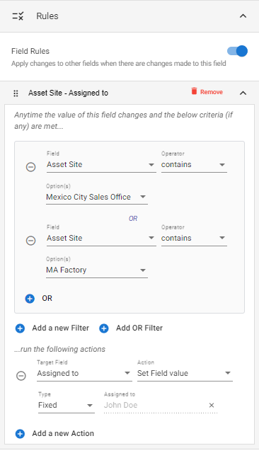
To add a Rule:
- Navigate to the Rules section of the determinant field’s properties (i.e., the field which, when modified, will affect other fields)
- Toggle Field Rules on.
- Select the “Add new Rule” button, and a new Rule will be added titled “Rule 1” (see image below).
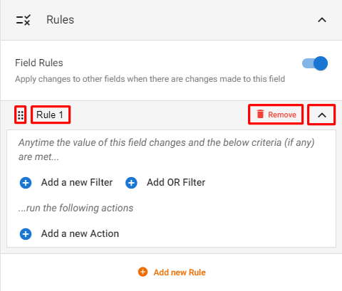
From left to right:
- Click and drag the 6-dots icon on the left-side to reorder Rules.
- The Rule title (“Rule 1” in the image above) can be changed by clicking directly on the title and editing the text.
- Remove will delete the Rule.
- Select the Arrow icon on the right-side of the Rule to expand/collapse the Rule’s conditions and actions.
The Rule Filters will determine when the Rule will run. In the example image at the beginning of this section, two “OR” filters were added, meaning if either of the conditions are met, the Rule Action(s) will run.
The Rule Action(s) will determine what the Rule does when it runs. In the example at the beginning of this section, the Rule Action will set a different field (the “Assigned to” field) to a fixed value (the user John Doe).
Upload to Drive (Attachment field)
Turn this option on to automatically upload all newly attached files to a specific Drive folder.
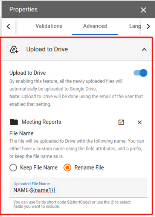
A few things to note:
- Whoever enables the feature will be the user used for uploading the files, so make sure that user has access to upload to that Drive.
- There is a restriction when selecting a Team Drive (Shared Drive). If you want to use a Shared Drive, you can click on “Enter folder ID manually” and paste the Folder ID of the Shared Drive. The folder ID is found within the URL — don’t copy the full URL as it will not work.
- You can either keep the file name as is, or you can rename the file using any field properties from the form. You can use the @ sign while typing and the select a field, or use the ${shortCode} of the fields you want to include.
- Files will be uploaded to Drive only when the user saves or clicks on any workflow action on the record.
- Files uploaded will not be deleted if the user deletes the file.
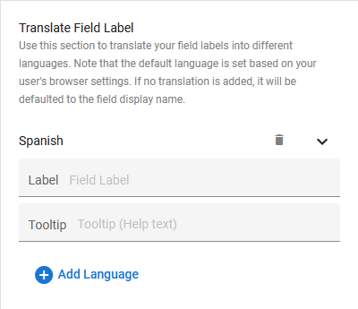
Language Tab
The language tab gives you the option to translate your Field Title and Help Text to any language.
To do so, simply click the ‘+ Add Language‘ button and select the desired language from the drop-down list. Then, type in your translation in the Label and Tooltip text area.
Once you create a translation, the language will change according to the users browser language settings.
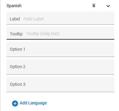
For Radio, Checkbox, and List Selection fields, the Language Tab will have additional boxes to translate the options you created.
| Click on the trashcan icon to remove a language option. |
Options Tab
The Options tab is unique to the field type. There are several fields with this tab: Rich Text, Radio Button, Checkbox, List Selection, Drive Picker, and Signature.
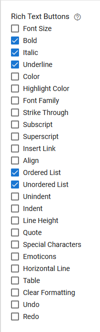
Rich Text
The Rich Text field options simply allow you to control which formatting options are available to users.
Radio Button & Checkbox
The Radio Button and Checkbox field options are identical.
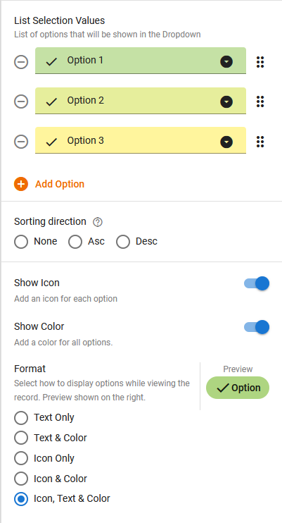
The List Selection Values section is where edit the name, order, and appearance of your list options. You may also add options with the ‘+ Add Option‘ button.
| Select this icon to remove an option. |
Sorting Direction will simply sort you options. If ‘None’ is selected, they will match the order in the List Selection Values section. To manually reorder, drag-and-drop the six dots on the right side of the option.
Show Icon displays individual icons to the left of the options. To change an icon, select it in the List Selection Values section (to the left of the list option) and select an icon from the pop-up.
Show Color will let you individually change the color of each list option. To change the color, select the down arrow to the right of the option in the List Selection Values section.
Format lets you choose how to display your options to users. The Preview on the right reflects how the user will see the options.
List Selection
The List Selection field options are also identical to the Radio Button & Checkbox options above. However, it also has two additional options.
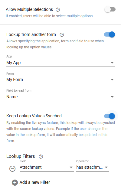
Allow Multiple Selections simply allows users to select more than one option.
Lookup from another form lets you search records from another form and use those records as options for the list selection. You cannot use this option with colors and icons, and turning it on will hide those options.
- App is the app to lookup from.
- Form is the associated form on the app.
- Field to read from is the field on the form to lookup the value from.
Lookup Filters is where you set addition conditions to filter the records by. In the example above, my list selection will display names from ‘My Form’, but will only show records that have attachments. The Operator is context sensitive to the type of field. For more on filtering and operators, click here.
Driver Picker
The Drive Picker field options are divided into two sections: Features, and View Options.
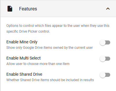
Features controls Google Drive permissions and visibility for the current user.
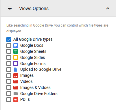
Views Options lets you specify which file types will display to the user while using this field.
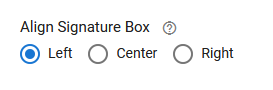
Signature
The Signature field options simply let you choose where in the available field space to display the signature box.