The Form Design Dashboard shows the designer all aspects of the form, plus related design components like views and email templates that are always tied to a specific form.
Form Design Dashboard Navigation
At the top left, in the design navigation, there is a list of the available forms. Selecting one of the forms will display the Form Design Dashboard for that form. This will give you direct access to the Form Editor tabs for the form along with the views, email templates and other design items that are directly associated with the selected form.
| Form Editor Navigation |
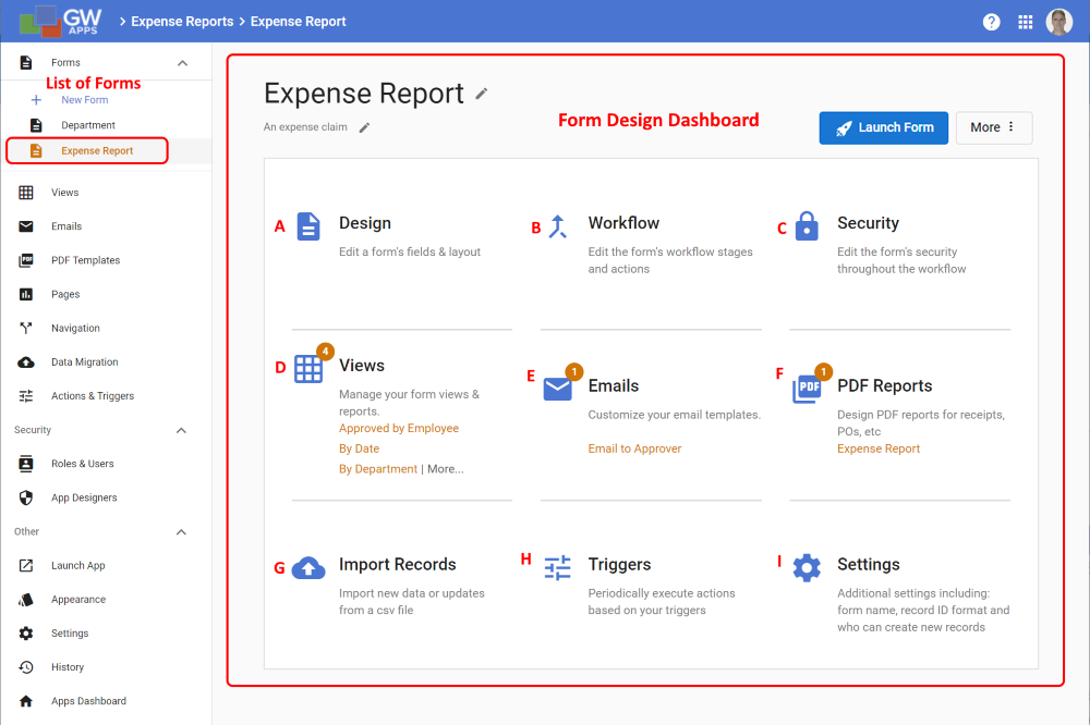 |
In the above example, the Expense Report form was selected and the Form Design Dashboard is displaying the items related to the Expense Report form:
| Item | Description |
| A | Design – Takes you to the form’s Design tab where the App Designer can edit the design of the selected form. Designers can add, remove, edit sections, and add fields and components. |
| B | Workflow – Takes you to the form’s Workflow tab where the App Designer can create and edit the workflow stages and actions of this form. |
| C | Security – Takes you to the form’s Security tab where the App Designer can set each role’s access to the form’s design elements (sections, fields, etc.) for the defined workflow stages. |
| D | Views – Displays a list of the views associated with the selected form. In this example there are 4, as shown by the number in the circle above the emails icon. The first 3 views are listed for direct access, with a “More …” link to see the full list of views associated with this form. |
| E | Emails – Displays a list of the email templates associated with the selected form. In this example there is only one, as shown by the number in the circle above the emails icon. The first 3 vs would be listed for direct access, with a “More …” link to see the full list of email templates associated with this form. As there is only one email template in this example, it is displayed and there is no “More …” link. |
| F | PDF Reports – Displays a list of the PDF templates associated with the selected form. In this example there is only one, as shown by the number in the circle above the PDFs icon. The first 3 PDF templates would be listed for direct access, with a “More …” link to see the full list of PDF Templates associated with this form. As there is only one PDF template in this example, it is displayed and there is no “More …” link. |
| G | Import Records – Starts the data migration wizard, similar to pressing the Data Migration link in the Design Navigator on the left. |
| H | Triggers – Takes you to the Triggers list, similar to pressing the Triggers link in the Design Navigator on the left. |
| I | Settings – Takes you to the form’s Settings tab where the App Designer can define the name and description for the form, specify who can create records using this form, and other settings. |
Next Steps
| Below are links to articles that cover the next level of detail on form design: |
| Form Editor Overview |
| In depth field features and settings |
| Form layout part 1: Sections |
| Form layout part 2: Columns |
| As an example of the many field types available: Working with Text fields |
| Below are links to the two form building parts of the Building an Expense Reports App tutorial series: |
| Part 3 – Starting the Expense Reports Form |
| Part 4 – Completing the Expense Reports Form |