The Form Editor is where the designer can create the desired form, with the fields and layout they need. It is also where the workflow and form security are set.
Form Editor Navigation
At the top of the Form Editor, you can navigate between the Design, Workflows, Security and Settings tabs, Preview the form, and Save or Close the form. You can also return to the App Dashboard by clicking on the App Dashboard icon, or by clicking on your company’s name at the top left, before the chevron and the application’s name.
| Form Editor Navigation |
 |
The Form Editor tabs are used for the following:
| Tab | Description |
| Design | The Design tab is where the App Designer can edit the design the selected form. Designers can add, remove, edit sections, add components and easily preview those changes. (The Design tab is discussed in this article and others in the in the Forms > Form Editor section.) |
| Workflow | The Workflows tab is where the App Designer can create and edit the workflow stages and actions associated with this form. (Workflow is discussed in the Workflow, Automation & Security section, and in detail in the following article: Workflow & Security Overview.) |
| Security | The Security tab is where the App Designer can set the access rights each role has for records, sections and fields for the defined workflow stages. (Security is discussed in the Workflow, Automation & Security section, and in detail in the following article: Workflow & Security Overview.) |
| Settings | The Settings tab is where the App Designer can define the name and description for the form, along with specify who can create records using this form. (The Settings Tab is discussed in the Forms > Form Editor section, and in detail in the following article: Form Editor: Settings Tab.) |
| Anonymous | The Anonymous tab has setting related to the Anonymous user feature of GW Apps. (Anonymous Access is discussed in the Workflow, Automation & Security section, and in detail in the following article: Security: Anonymous Access.) |
| SLA | The SLA tab allows configuring Service Level Agreements (SLAs) for the workflow stages related to this form. (SLAs are discussed in the Workflow, Automation & Security section, and in detail in the following article: Service Level Agreement (SLA).) |
Navigator Actions
| Icon | Name | Description |
 |
Launch Form | Closes the form editor and opens the application with the form displayed, ready to create a new record. |
 |
Save | Saves all changes to the form. You will remain in the Form Editor after clicking on this option. |
 |
Save & Close | Saves all changes to the form. You will remain in the Form Editor after clicking on this option. |
 |
Close | Closes the form, returning you to the Forms Dashboard. |
 |
Form Layout & Appearance | Opens the a dialog with display options for the current form. |
 |
Disable Drag | Prevents elements on the form from being moved around via grag-and-drop. |
 |
Preview | Opens the preview dialog with the current form loaded, so that the App Designer can see how it will display to end users. |
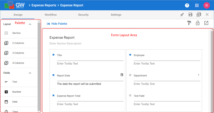
Design Tab Screen Layout
The Design tab of the Form Editor has three areas:
| Name | Location | Purpose |
| Palette | Left Side | The palette is the list of layout component and fields that can be placed onto the form.
When the Properties Panel is displayed, the Palette is made narrower and only shows the icons for the layout component and fields. |
| Form Layout Area | Middle | This is where the form you are designing is built and displayed. Fields are dragged from the Palette and dropped on the Form Layout Area to created the design of the form. |
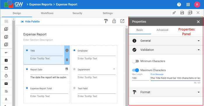
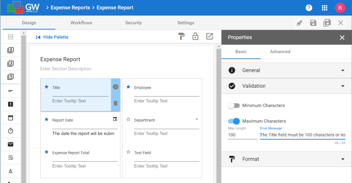
| Properties Panel | Right Side | This is where all the settings for the fields can be adjusted.
The Properties Panel only displays when it is activated. When you first open a form only the Palette and Form Layout Area are shown. The Properties Panel displays when the designer clicks on the properties icon for the field or component. |
They look like this:
| Design Tab with Properties Panel Hidden |
 |
| Design Tab with Properties Panel Shown |
 |
Form Editor Design Basics
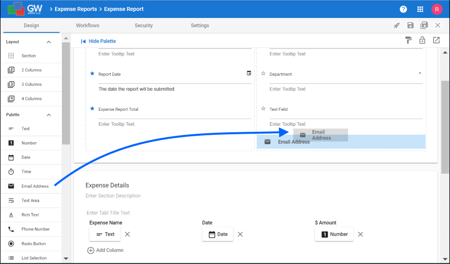
You create your form by finding the desired field type on the palette on the left side of the screen, then just drag & drop it onto the desired location on the form. You can also drag & drop existing fields within the form to change its layout. There are also components that allow you to choose one, two three or four column layout areas, a bit like putting things in a table in a document so they stay where you want them to.
| Drag & Drop Form Design |
 |
You can then change the settings for the new field by typing them directly on the field or via the properties panel on the right side. (Click on the i icon on the right side of the field to open the Properties Panel.)
| Form Editor Properties Panel |
 |
Once the form is laid out, move on to the Workflows, Security and Settings tabs to complete the design.
Next Steps
| Below are links to articles that cover the next level of detail on form design: |
| In depth field features and settings |
| Form layout part 1: Sections |
| Form layout part 2: Columns |
| As an example of the many field types available: Working with Text fields |
| Below are links to the two form building parts of the Building an Expense Reports App tutorial series: |
| Part 3 – Starting the Expense Reports Form |
| Part 4 – Completing the Expense Reports Form |