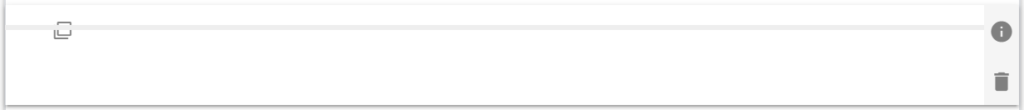
A Divider Component is used to visually split the form. It is used when a Section is too visually dramatic division of the forms layout. The visual style of the divider can be controlled.
| The default look of the horizontal line component |
 |
Divider Component Properties
| Divider Properties |
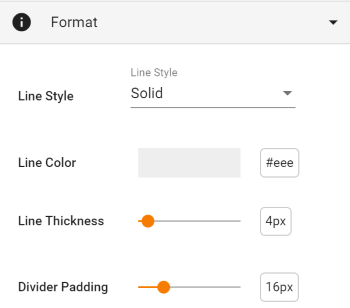 |
| Setting | Description |
| Basic Tab / Format | |
| Line Style | Select from Solid, Dashed, Dotted or Double. |
| Line Color | Use the color picker widget to select the desired color |
| Line Thickness | Use the slider to select the desired line thickness, in pixels. The default value is 4, but any value between 1 and 32 is available, |
| Divider Padding | Use the slider to select the desired padding above and below the divider line, in pixels. The default value is 16, but any value between 8 and 40 is available, |
| Advanced Tab / Conditional Visibility – See Conditional Visibility | |
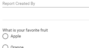
Usage Example
| Divider Usage Example |
 |