Workflow action buttons are the way a reviewer can tell an app what they would like to do to the record they are reviewing.
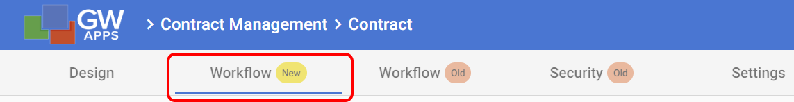
Note: This page is about the new workflow user interface (UI), found on the Workflow New tab. The original workflow UI is still available for now, on the ‘Workflow Old’ and ‘Security Old’ tabs that follow it. The available features are similar, but a few of the latest minor features are only available via the new workflow UI.
Action Buttons Overview
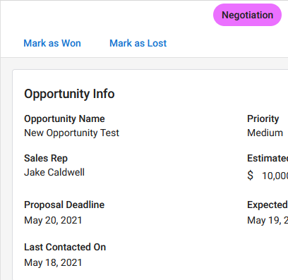
Generally, action buttons are used to move the record along in the workflow. For example, at the Manager Review stage there might be ‘Approve’, ‘Reject’ and ‘Return to Submitter’ action buttons, and hitting ‘Approve’ might move the record to the VP Review stage.
Workflow action buttons are associated with a specific workflow stage, so you must define the Workflow Stage before you can add any workflow action buttons to it. For details on creating and managing Workflow Stages, please see the following article > Workflow: 1 – Stages
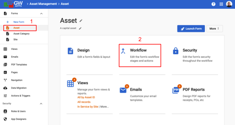
Workflow action buttons are created and managed from the Workflow tab on the forms design. To access the workflow action buttons of a form:
| Edit App > Click on the desired form’s tile (1) > Click on the Workflow option (2) |
 |
(3) Then select the desired workflow stage:
By default, all of the action buttons will display on all records currently at the selected workflow stage. However, you may hide specific action buttons in different situations or from different people by configuring the button security or using Form Security (more on these below):
Create Action Buttons
A workflow stage can have as many action buttons as required. Typical actions might be things like: Approve, Reject or Request Finance Review.
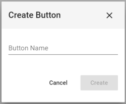
To create an action button, select the desired stage from the list on the left side of the screen, and then click on ‘+ New Button’ at the top of the Action Buttons section in the lower half of the screen.
| Create Button Dialog |
 |
| Item | Description |
| Button Name | Enter the name of the new action button. |
 | Click to close the dialog and cancel the action button creation. |
 | Click to close the dialog, create the new action button and be taken back to the Workflow tab. |
After creating an action button, the button properties panel will immediately open on the right – this is where you configure and customize your button. Details are covered in the Configuring Action Buttons section a little further down the page.
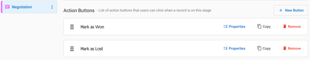
Manage Action Buttons
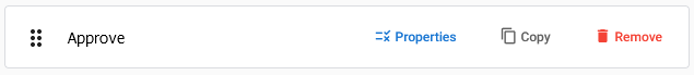
Click and drag the six (6) dots icon on the far left of the action button to reorder the list of buttons. When displayed on records, while using the app, the buttons will display in list order from left to right, starting with the first button in the list.
You can edit the button name by selecting it here. This is one of two places you can edit the name – the other being the Format section of the button properties.
Properties opens the button properties.
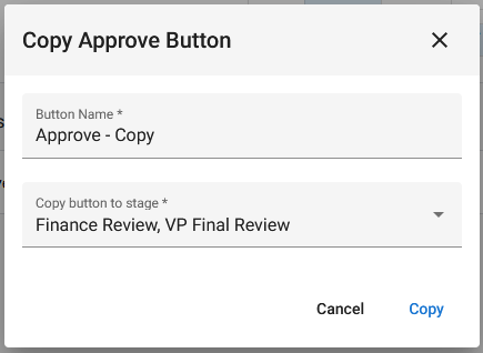
Copy will duplicate the button and all of it’s properties, and allow you to add it to any stage(s), including the current stage.
Remove deletes the button.
Configuring Action Buttons
There are a lot of possible configuration options for workflow action buttons. To help get the essential options covered more simply, we have split the documentation for workflow action buttons into two articles. This ‘Basics’ article, and the subsequent ‘Advanced’ article (Workflow: 3 – Action Buttons (Advanced)). We will cover the most commonly used action button features here, and the more advanced ones in the second article.
After creating an action button, the button properties panel will immediately open on the right. To edit the settings of an existing action button, click on the ‘Properties‘ icon on the button.
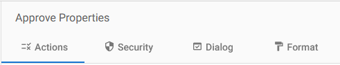
The button properties are broken down into four tabs:
- Actions: Define what the button should do, the actions to run when the button is clicked.
- Security: Configure button visibility.
- Dialog: Settings for an optional confirmation dialog.
- Format: Define the visual appearance of the button.
We are only going to cover some basic settings on the Actions tab, as this is often all that an action button needs. All the other details can be found in the the subsequent ‘Advanced’ article: Workflow 3 – Action Buttons (Advanced).
Most action buttons are simple and should always do the same thing every time they are pressed. In this case, we just need to define the Default Actions, and don’t need to worry about any Conditional Actions.
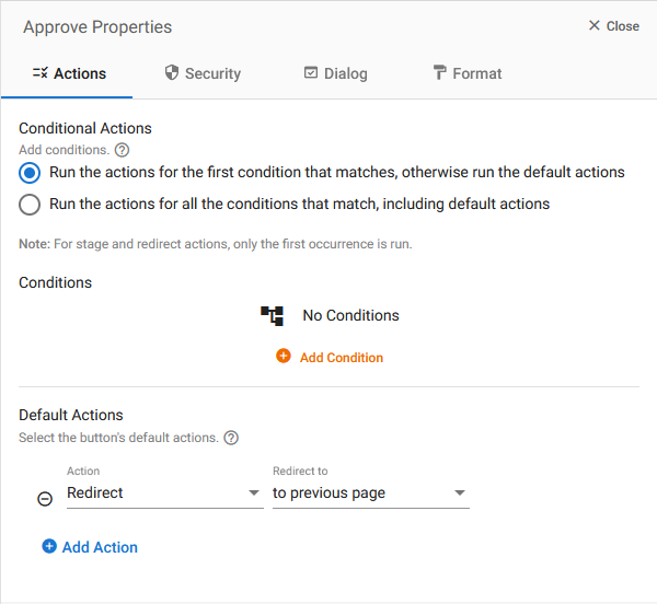
Actions
There are a total of 11 types of actions, but we will cover the three most commonly used ones here (The rest will be covered in the advanced article):
| Action Type | Description |
| Change Stage | Move the record to a new workflow stage and set the workflow status accordingly, e.g. Draft to Manager’s Approval or VP Approval to Rejected. Once you select ‘Change Stage’ as the type, you will see the ‘Next Stage’ field. Select the desired stage records should move to when this button is clicked. |
| Send Email | Allows you to select or create an email template so that an email message is sent to interested parties when the workflow action button is pressed. Once you select ‘Send Email’ as the type, you will see the ‘Select’ field to allow you to select the desired email template, or create a new one. Details for working with email templates to create customized notification messages are shown here: Email Templates. |
| Redirect | Allows you to select what should be seen by the user after the action button is pressed, e.g. go back to the prior view or open a specific form. Select between the following options: – to viewing record (Keeps you looking at the record, but puts it into View mode) – to editing record (Keeps you looking at the record, but puts it into Edit mode) – to another form – to a page – to a view – to previous page (Usually takes you back to the view from which the record was opened or created) – to dashboard (Takes you to the applications dashboard) Then, if ‘to another form’, ‘to a page’ or ‘to a view are selected, pick the desired Form, Page or View from the supplied list. |
Next Steps
| Below are links to articles that cover the other main areas of creating a workflow: |
| Workflow Stages |
| Workflow Security |
| Email Templates |
| Below are the links to the episodes of Building an Expense Reports App tutorial series that include descriptions of setting up a workflow: |
| Part 5 – Expense Reports App – Workflow |
| Part 6 – Expense Reports App – Security |