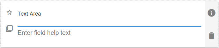
A multi-line text entry field. The Text Area field does not allow text formatting like the Rich Text control does. Typical usage examples include: Description and Comments.
| The default look of the Text Area component |
 |
Text Area Field Properties
| Setting | Description |
| Basic Tab / General Settings | |
| Display Name Field Help Text Required |
See General Field Features |
| Basic Tab / Validation Section | |
| Maximum Allowed Characters | Enable to set a maximum number of characters. Displays the following two fields when enabled: |
| Max Length | Enter the desired maximum number of characters. |
| Message to show users | Enter the text to display when the user entered value has a higher number of characters than the Max Length value. |
| Basic Tab / Format Section | |
| Text Format | Select from:
|
| Remove Extra Spaces | Enable to have duplicate spaces, two or more spaces in a row, removed from the field text. |
| Advanced Tab / Concatenation – See below, or see Concatenation | |
| Advanced Tab / Conditional Visibility – See Conditional Visibility | |
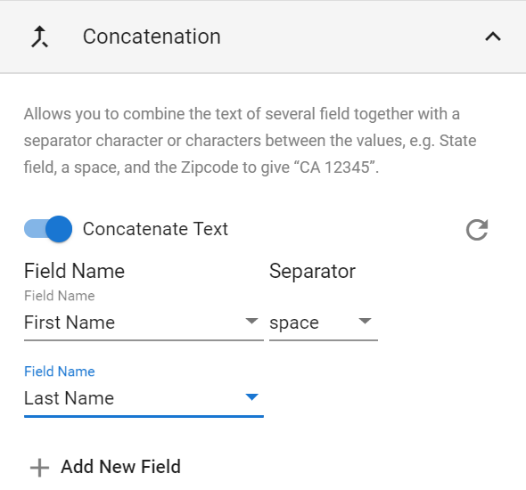
Concatenate Text Options
Allows you to combine the text of several text-like fields together with a separator character or characters between the values, e.g. State field, a space, and the Zipcode to give “CA 12345”.
| Concatenate Text Options |
 |
| Setting | Description |
| Field Name | Select the desired field from the list, or select Custom and type the desired text into the field. |
| Spacer | Select an option from the list, or select Custom and type the actual desired spacer text into the field. Defined options are:
|
 |
Delete this row. Only available for rows three and above. |
 |
Adds a new Field Name field at the bottom of the list, and adds a Spacer field after the prior Field Name field. |
Usage Example
| Text Area Usage Example |
 |