The View Editor is used to create and customize your views. The View Editor is divided into three or four tabs, depending on whether or not Anonymous Access is enabled:
| Item | Description |
| Settings Tab | General settings and color options. |
| A View Specific Tab | Each view type (Table, Calendar, and Kanban) has a unique middle tab with view type specific settings. |
| Filters Tab | Security, sorting, and filtering options. |
| Anonymous Tab | Enable Anonymous Access for the view, allowing anyone with a link to access the view. Note: This tab only displays if Anonymous Access is enabled by a platform admin in the Platform Settings. To learn more about Anonymous Access settings, see: Security: Anonymous Access |
We discussed the three view types (Table, Calendar, and Kanban) in the Views Overview article. Each view type has a unique display style and suits a different purpose. These view types have many common setting that they all utilize, but also some setting specific to only that view type. The specific setting that are unique to each of the view types are covered in the following articles: View Editor: Table Views, View Editor: Calendar Views and View Editor: Kanban Views.
The Settings Tab and Filters Tab display for all three view types and are nearly identical for each type.
Settings Tab
These are the general settings and color options for your view. The sections below are organized in the order they appear when you select the Settings Tab.
Note: Not all of these settings will be present for each type of view. All of the following settings are present in a Table view. The other two views only contain certain settings from this list, but they do not contain any additional settings not displayed here.
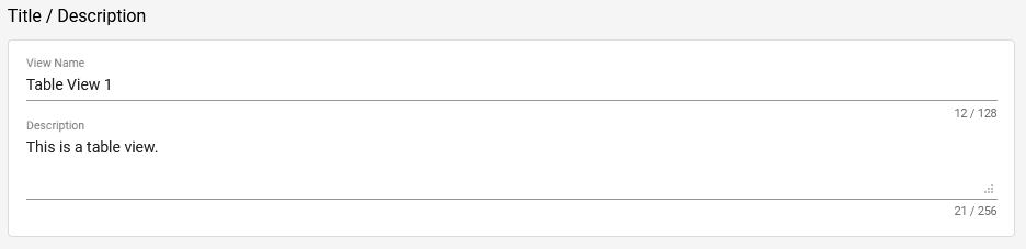
Title / Description
| Item | Description |
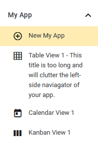
| View Name | The name of the view. It displays at the top of the view and in the left-side navigator, so make sure it properly describes the view’s purpose or what it displays. Tip: Consider keeping the title short so that it doesn’t take up too much space in the left-side navigator. See the example below. |
| Description | You may also add an optional Description, which is only visible in the App Editor. |
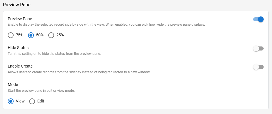
Preview Pane
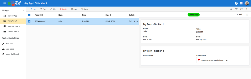
Enabling the Preview Pane will allow a record to display in a right-side panel within the view, instead of having it open and replace the view. You can pick how wide to display the record in relation to the view.
| Item | Description |
| Preview Pane | Enable or disable the preview pane functionality. You can select the width of the Preview Pane as a percentage of the width of the view: 75% (the preview pane uses three-quarters of the screen width currently used by the view), 50% or 25%. |
| Hide Status | When enabled, it stops the record’s workflow status from displaying at the top of the preview pane. In the example image blow, the ‘Completed‘ status would not be shown. |
| Enable Create | l allow users to create new records within the preview pane, instead of in a new window. Simply click the ‘+ New‘ button in the top left of the view, and a new record will open in the preview pane. |
| Mode | Determines how existing records open in the preview pane, in view mode or in edit mode. You may also switch between the two modes in the top right corner of the preview pane at any time. |
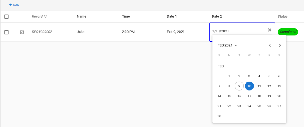
To open a record in a new window while Preview Pane is enabled, select the record and click ‘View’ or ‘Edit’ on the bar above the view. (Note: If ‘Edit Cells In Table‘ is also turned on, you must select the checkbox to get these options, since clicking on the record won’t select it.)
Editable Cells
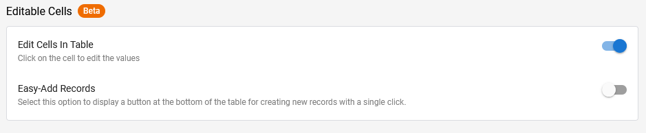
Edit Cells In Table will allow you to edit record fields directly from the view. Obviously, only fields that display in the view can be edited this way. To edit fields that are not displayed in the view, you will still need to open the record.
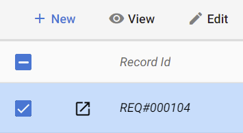
 | Select this icon to open the record when using Edit Cells In Table. (If Preview Pane is also turned on, this will open the record in the preview pane.) |
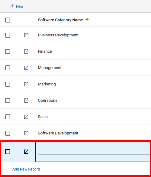
Easy-Add Records will allow you to add new records directly to the view (rather than opening the form or using a Preview Pane) using a ‘+ Add New Record‘ button at the bottom of the page.
Tip: This is particularly useful for very simple forms. For example, a form whose records are used as lookup values on a more complex form.
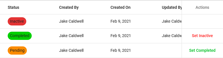
Action Column
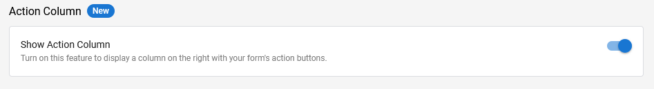
Show Action Column will display your workflow action buttons on the far right of each record within the view. This allows you to take actions on records without opening the record.
Record Copy
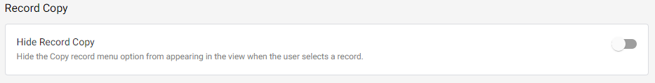
Hide Record Copy will disable the “Copy Record” option in the view. By default, users can copy/duplicate records when editing a record, viewing a record, or from within a View. This options disables the latter. To disable this option while editing or viewing record, navigate to the Form Settings Tab.
Pagination
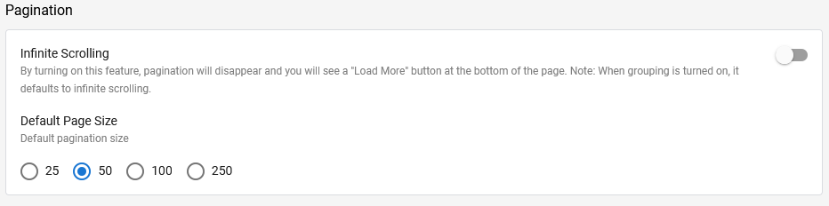
| Item | Description |
| Infinite Scrolling | Allows users to continuously scroll through the view by clicking ‘Load More’ at the bottom of the page. When grouping is turned on, infinite scrolling becomes the default option. |
| Default Page Size | Determines how many records are shown in the view, the page size, when it first opens. Once the view is open the user can change the page size at any time and scroll forwards and backwards through the pages of the view (assuming there are more records than the current page size). These options disappear when ‘Infinite Scrolling’ is turned on. |
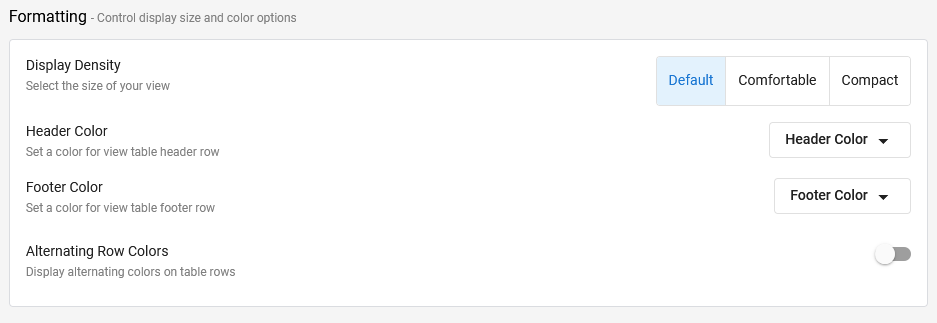
Formatting
The formatting options control the display size and colors for your view.
| Item | Description |
| Display Density | Controls the amount of space between the rows of view data (padding) and ‘Compact’ also reduces the font size used to display the view data. This allows you to display more rows of data, but with less space between the data values, or fewer rows of information, but with the data more spaced out. ‘Comfortable’ is a good choice if your application will have many rows of records in the view. |
| Header Color | Allows you to set the color of the view’s header bar, where the ‘+ New’ and search and filtering options display. The default is a light grey, as shown in the examples in this article. |
| Footer Color | Allows you to set the color of the views footer, where the paging controls display. The default is white. |
| Alternate Row Colors | Displays alternate rows in the view in different colors. This helps users more easily scan across the view and stay on the right row as they do. Enabling ‘Alternate Row Colors’ will display two new color selection fields: ‘Color 1’ and ‘Color 2’. The default colors are white and a light grey, and these are the recommended colors. Using a strong color for the alternate rows will make it harder to see the actual data in the view. The default colors may seem very pale, but they are enough to do their job and will not distract users from seeing the view’s data. Tip: We recommend using Alternate Row Colors for all views, and using the default colors. |
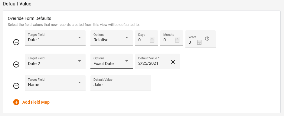
Default Value
Override Form Defaults allows you to auto populate specific fields when you create a new record from the view. This includes using the ‘+ New‘ button in the top left of the view, as well as using the Easy-Add Records ‘+ Add New Record‘ button. This does not apply to records created directly from the form.
| Item | Description |
| Target Field | The field to set a default value for. |
| Default Value | The value to set for the specified Target Field. (Displays for fields that don’t have a list of values to select from.) |
| Options | Displays only if the Target Field is a date field. Selected one of the following values: – Relative – Additional Days, Month and Years fields will display, allowing you to define a new date value by how far in the future (positive values) or past (negative values) it is relative to the date when the record is created. – Exact Date – The required default date value is directly entered into the Default Value field. |
Filters Tab
You can further modify your view by applying sorting, grouping, and filtering, plus view access permissions and record exporting options.
Note: These Filters Tab options are all present in the Table view, and also the Kanban view. But the Calendar view does not have Default View Sorting or Default View Grouping.
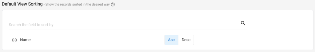
Default View Sorting
A sorted view is simply a view that has been sorted: Its records are organized into a defined order based on their data. It’s very similar to sorting columns in a spreadsheet.
Default View Sorting defines how the records in the view will be sorted when the view is opened. A user can change the view sorting by clicking on a columns header, or by clicking on the view options icon in the view header. However, upon leaving the view and returning, the sorting will return to the order define in Default View Sorting.
| Item | Description |
| Search the field to sort by | Clicking in this field displays a drop-down list of field names. Either scroll up or down in the list to find the desired field, or start typing the field name to filter the displayed list to those that match the character(s) you have typed. Select the desired field name once you see it in the list. |
| Asc | Select to define the sort order a ascending (A > Z) |
| Desc | Select to define the sort order a descending (Z > A) |
 | Click on this icon to remove the associated sorting condition. |
Default View Grouping
Default View Grouping defines how the records in the view will be grouped when the view is opened. A user can change the view grouping by clicking on the view options icon in the view header. However, upon leaving and returning to the view, the grouping will return to the Default View Grouping. (See the article Views: An Overview for an explanation and example of view grouping.)
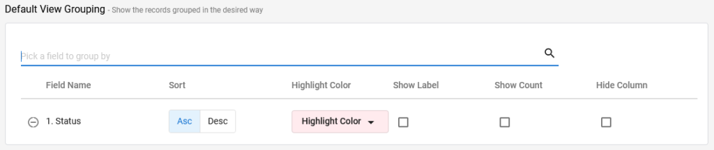
| Item | Description |
| Pick a field to group by | Clicking in this field displays a drop-down list of field names. Either scroll up or down in the list to find the desired field, or start typing the field name to filter the displayed list to those that match the character(s) you have typed. Select the desired field name once you see it in the list. |
| Field Name | Names of already selected grouping fields. |
| Asc | Select to define the sort order a ascending (A > Z) |
| Desc | Select to define the sort order a descending (Z > A) |
| Highlight Color | Select the desired color to use in the group row. |
| Show Label | Shows the field label (name) above the value in the group row. (As you usually group by values your users would immediately recognize, such as department, state or year, the ‘Show Label’ option isn’t usually needed.) |
| Show Count | Shows the number of records in this group after the group value in the group row. This is often useful information and so is often selected. |
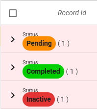
| Hide Column | Will hide the field column from the main body of the view, you will only see the column value in the group row. For example, if you group by status and select ‘Hide Column’, when you expand the group you will not see a separate column for status in the view (so you will not see the status value twice). |
| Click on this icon to remove the associated sorting condition. |
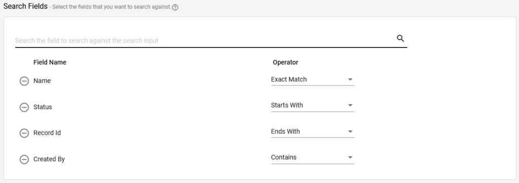
Search Fields
Search Fields controls which field values a search will actually look at when searching from this view. Leaving the Search Fields section empty will tell GW Apps to search against all field values in the records. Adding any field names to the Search Fields section empty will tell GW Apps to only search against the listed field values in the records, and also how the comparison should be done.
| Item | Description |
| Pick a field to group by | Clicking in this field displays a drop-down list of field names. Either scroll up or down in the list to find the desired field, or start typing the field name to filter the displayed list to those that match the character(s) you have typed. Select the desired field name once you see it in the list. |
| Field Name | Names of selected fields. |
| Operator | Defines how the search comparison will be done. Select one of the following options: – Exact Match – Will only show records with an exact match in the associated field. For example, in the picture above I have selected the ‘Name’ field with the ‘Exact Match’ operator. If I search for ‘Jake’, the only records that will display are those that have exactly ‘Jake’ in the name field. A record with ‘Jake C’ in the name field or ‘Jak’ would not show. – Starts With – Will only show records that start with the search input in the associated field. For example, if I use the ‘Name’ field with this operator and I type the letter ‘J’ in the search bar, only records with names that start with ‘J’ will show up, so ‘Jake’, ‘Jake C’ and ‘Jeff’ would all match, but not “Fred’. – Ends With – Similar to Starts With, but reversed: Only records ending with the search input in the associated field, will show up. – Contains – Will only show records that contain the search input somewhere within the associated field. This is how search works if no search fields are defined, the search value can appear anywhere within a filed, but now it applies to only the specified field. So searching for ‘ake’ will match ‘Jake’, ‘Cake’ or Handbrake’, but not ‘Jak’ or ‘Fish’. |
| Click on this icon to remove the associated sorting condition. |
Filtering
Filters allow you to restrict the records that are displayed in the view to only those that match the specific criteria, e.g., only records where the Status field has the value of ‘Completed’ and/or the Department field has the value of ‘Sales’. (More than one filter can be applied to a view.)
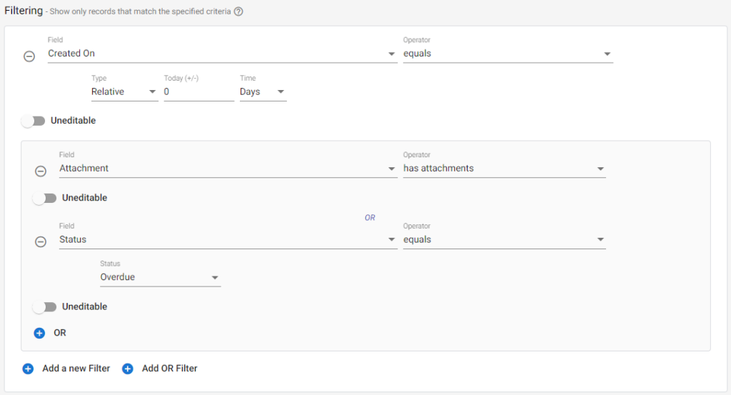
There are two kinds of filtering:
| Item | Description |
| + Add a new Filter | Selecting this option will add an “AND” filter, meaning that records must meet all of the criteria specified to be visible. |
| + Add OR Filter | Selecting this option will add an “OR” filter. After selecting this option, a box with a shaded background will appear, and anything within this box will be handled as an “OR” condition. With OR filters, records that meet one OR another of the conditions will be visible. |
Field is the desired field to filter by. (Not all fields will show in the list. Special fields types such as Rich Text will not be shown.)
Operator options are context sensitive to the type of field selected. Options include:
| Text Field | Numeric Field | Time Field | Date Field | Drive Picker / Attachment | Created By / Updated By | Status |
| equals | greater than | equals | before | has attachments | equals | equals |
| does not equal | less than | not equals | after | does not have attachments | was | |
| blank | less than or equal to | after | equals | |||
| not blank | greater than or equal to | before | ||||
| contains | equals | blank | ||||
| does not contain | not equals | not blank |
Value is the value to compare the field to. This is also context sensitive to the type of field selected:
- Text or List fields will require a text entry.
- Date fields will require you to choose a type: Fixed or Relative. Fixed has a date picker; Relative is calculated by adding the day, month, or year values to the current date. A zero would mean only records created today would show (demonstrated in the image above), and a negative number would mean only records created ‘X’ Days/Months/Years in the past will show.
- Numeric fields will require a number entry.
- Status fields will have a drop-down list with the workflow stages (you can select multiple).
Uneditable makes the filter a fixed part of the view design. If Uneditable is turned off, the application user will be able to override the filter while using the application. If it is on, the user will be able to apply additional filters, but not remove this one.
 | Select this icon to remove a filter. |
Exports
You can control which export options to allow for each of your views.
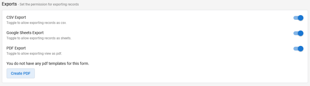
PDF Export, when toggled on, will require that you select (or create if you don’t have one yet) a PDF Template.
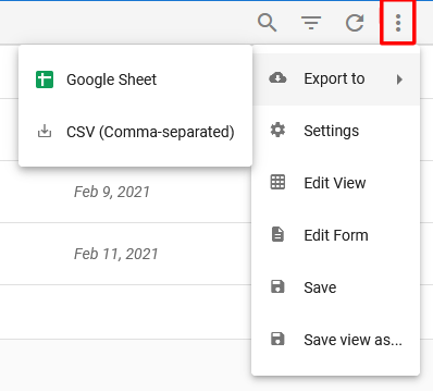
To export from a view, select the three dots in the top right corner of the view.
Security
Security determines who has permission to see the view.
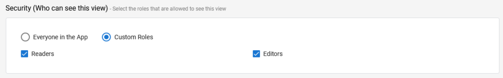
| Item | Description |
| Everyone in the App | Everyone who has access to the application, i.e. their name appears in one of the roles defined in the app. |
| Custom Roles | Selecting ‘Custom Roles’ displays checkboxes for each role defined in the app. You can select the roles who should have access. If no roles are selected, then nobody will be able to see the view. |
Demonstration Video
The following video outlines creating views:
Next Steps
| Below are links to articles that cover specifics for the 3 types of views, and another on how to adjust the design of a view while looking at it, using in-view editing: |
| View Editor: Table Views |
| View Editor: Calendar Views |
| View Editor: Kanban Views |
| Views: In View Editing |
| Below is the link to the view building part of the Building an Expense Reports App tutorial series: |
| Part 7 – Views |