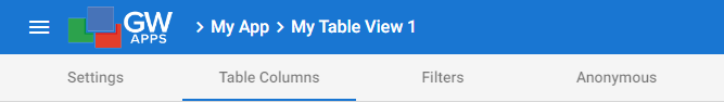
El Editor de vistas se utiliza para crear y personalizar las vistas. El Editor de vistas se divide en tres o cuatro pestañas, dependiendo de si está activado o no el Acceso anónimo:
| Artículo | Descripción |
| Pestaña de configuración | Ajustes generales y opciones de color. |
| Una pestaña específica de la vista | Cada tipo de vista (Tabla, Calendario y Kanban) tiene una pestaña central única con ajustes específicos del tipo de vista. |
| Pestaña de Filtros | Opciones de seguridad, clasificación y filtrado. |
| Ficha anónima | Habilite el Acceso anónimo para la vista, permitiendo que cualquier persona con un enlace acceda a la vista. Nota: Esta pestaña sólo se muestra si el Acceso anónimo está habilitado por un administrador de la plataforma en la Configuración de la plataforma. Para obtener más información sobre la configuración del Acceso anónimo, consulte: Seguridad: Acceso anónimo |
Hemos hablado de los tres tipos de vistas (Tabla, Calendario y Kanban) en el Visión general de las vistas artículo. Cada tipo de vista tiene un estilo de visualización único y se adapta a un propósito diferente. Estos tipos de vista tienen muchas configuraciones comunes que todos utilizan, pero también algunas configuraciones específicas para ese tipo de vista. La configuración específica que es única para cada tipo de vista se cubre en los siguientes artículos: Editor de vistas: Vistas de tabla, Editor de vistas: Vistas del calendario y Editor de vistas: Vistas Kanban.
Las pestañas Ficha de configuración y Filtros Pestaña se muestran para los tres tipos de vista y son casi idénticos para cada tipo.
Pestaña de configuración
Estos son los ajustes generales y las opciones de color para su vista. Las secciones siguientes están organizadas en el orden en que aparecen cuando se selecciona la pestaña de configuración.
Nota: No todos estos ajustes estarán presentes para cada tipo de vista. Todos los ajustes siguientes están presentes en la vista de tabla. Las otras dos vistas sólo contienen algunos ajustes de esta lista, pero no contienen ningún ajuste adicional que no se muestre aquí.
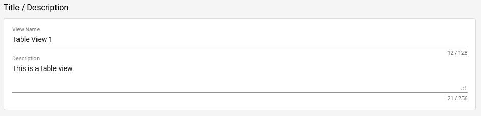
Título / Descripción
| Artículo | Descripción |
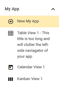
| Ver nombre | El nombre de la vista. Se muestra en la parte superior de la vista y en el navegador de la izquierda, así que asegúrese de que describe adecuadamente el propósito de la vista o lo que muestra. Consejo: Procure que el título sea corto para que no ocupe demasiado espacio en el navegador de la izquierda. Vea el ejemplo siguiente. |
| Descripción | También puede añadir una Descripción opcional, que sólo es visible en el Editor de aplicaciones. |
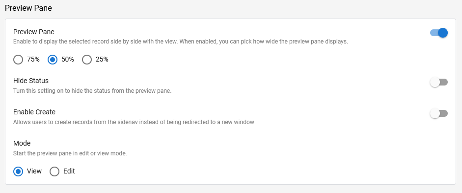
Panel de vista previa
Al activar el panel de vista previa, un registro se mostrará en un panel a la derecha de la vista, en lugar de abrirse y reemplazar la vista. Puede elegir el ancho del registro en relación con la vista.
| Artículo | Descripción |
| Panel de vista previa | Activar o desactivar la funcionalidad del panel de vista previa. Puede seleccionar el ancho del panel de vista previa como un porcentaje del ancho de la vista: 75% (el panel de vista previa utiliza tres cuartas partes de la anchura de la pantalla utilizada actualmente por la vista), 50% o 25%. |
| Ocultar estado | Cuando está activada, impide que el estado del flujo de trabajo del registro se muestre en la parte superior del panel de vista previa. En la imagen de ejemplo, no se mostrará el estado "Completado". |
| Activar la creación | l permitir a los usuarios crear nuevos registros dentro del panel de vista previa, en lugar de en una nueva ventana. Basta con hacer clic en el botón "+ Nuevo" de la parte superior izquierda de la vista, y se abrirá un nuevo registro en el panel de vista previa. |
| Modo | Determina cómo se abren los registros existentes en el panel de vista previa, en modo de visualización o en modo de edición. También puede cambiar entre los dos modos en la esquina superior derecha del panel de vista previa en cualquier momento. |
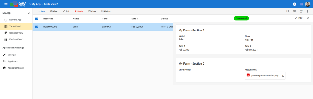
Para abrir un registro en una nueva ventana mientras el Panel de vista previa está activado, seleccione el registro y haga clic en 'Ver' o 'Editar' en la barra situada encima de la vista. (Nota: Si también está activada la opción ' Editar celdas en la tabla', debe seleccionar la casilla de verificación para obtener estas opciones, ya que al hacer clic en el registro no se seleccionará).
Celdas editables
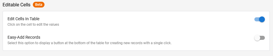
Editar celdas en la tabla le permitirá editar los campos del registro directamente desde la vista. Obviamente, sólo los campos que se muestran en la vista pueden ser editados de esta manera. Para editar los campos que no se muestran en la vista, tendrá que abrir el registro.
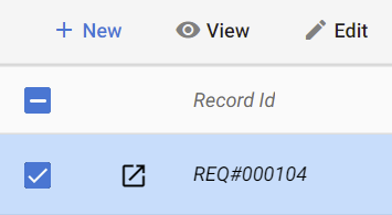
 | Seleccione este icono para abrir el registro cuando utilice Editar celdas en la tabla. (Si Panel de vista previa también está activado, esto abrirá el registro en el panel de vista previa). |
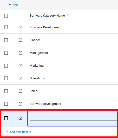
Easy-Add Records le permitirá añadir nuevos registros directamente a la vista (en lugar de abrir el formulario o utilizar un Ppanel de revisión) utilizando un botón "+ Añadir nuevo registro" en la parte inferior de la página.
Consejo: Esto es particularmente útil para formularios muy simples. Por ejemplo, un formulario cuyos registros se utilizan como valores de búsqueda en un formulario más complejo.
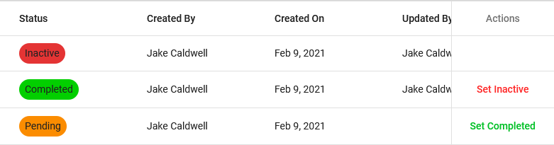
Columna de acción
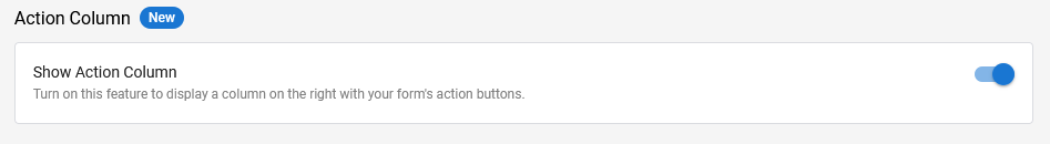
Mostrar columna de acciones mostrará los botones de acción de su flujo de trabajo en el extremo derecho de cada registro dentro de la vista. Esto le permite realizar acciones en los registros sin abrirlos.
Copia de registro
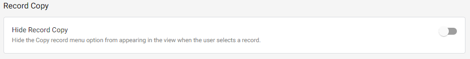
Ocultar copia de registros desactivará la opción "Copiar registro" en la vista. Por defecto, los usuarios pueden copiar/duplicar registros cuando editan un registro, visualizan un registro o desde dentro de una Vista. Esta opción desactiva esta última opción. Para desactivar esta opción durante la edición o visualización de un registro, vaya a la pestaña Configuración del formulario.
Paginación
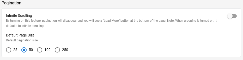
| Artículo | Descripción |
| Desplazamiento infinito | Permite a los usuarios desplazarse continuamente por la vista haciendo clic en "Cargar más" en la parte inferior de la página. Cuando la agrupación está activada, el desplazamiento infinito se convierte en la opción por defecto. |
| Tamaño de página por defecto | Determina cuántos registros se muestran en la vista, el tamaño de la página, cuando se abre por primera vez. Una vez abierta la vista, el usuario puede cambiar el tamaño de la página en cualquier momento y desplazarse hacia delante y hacia atrás por las páginas de la vista (suponiendo que haya más registros que el tamaño de la página actual). Estas opciones desaparecen cuando se activa el "Desplazamiento infinito". |
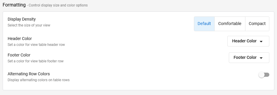
Formato
Las opciones de formato controlan el tamaño y los colores de la vista.
| Artículo | Descripción |
| Densidad de la pantalla | Controla la cantidad de espacio entre las filas de datos de la vista (relleno) y 'Compactar' también reduce el tamaño de la fuente utilizada para mostrar los datos de la vista. Esto le permite mostrar más filas de datos, pero con menos espacio entre los valores de los datos, o menos filas de información, pero con los datos más espaciados. 'Cómodo' es una buena opción si su aplicación tendrá muchas filas de registros en la vista. |
| Color de la cabecera | Permite establecer el color de la barra de cabecera de la vista, en la que se muestran las opciones "+ Nuevo" y de búsqueda y filtrado. El valor por defecto es un gris claro, como se muestra en los ejemplos de este artículo. |
| Color del pie de página | Permite establecer el color del pie de página de las vistas, donde se muestran los controles de paginación. El color por defecto es el blanco. |
| Colores alternativos de las filas | Muestra filas alternas en la vista en diferentes colores. Esto ayuda a los usuarios a escanear más fácilmente la vista y permanecer en la fila correcta mientras lo hacen. Al activar la opción "Colores alternativos de las filas" se mostrarán dos nuevos campos de selección de color: "Color 1" y "Color 2". Los colores por defecto son el blanco y el gris claro, y son los recomendados. Utilizar un color fuerte para las filas alternativas hará más difícil ver los datos reales en la vista. Los colores por defecto pueden parecer muy pálidos, pero son suficientes para hacer su trabajo y no distraerán a los usuarios de ver los datos de la vista. Consejo: Recomendamos utilizar Colores de Filas Alternas para todas las vistas, y utilizar los colores por defecto. |
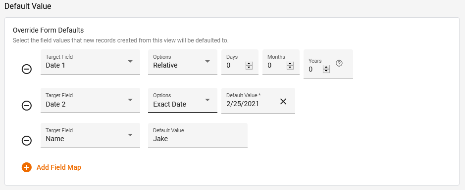
Valor por defecto
Anular los valores predeterminados del formulario le permite rellenar automáticamente campos específicos cuando crea un nuevo registro desde la vista. Esto incluye el uso del botón '+ Nuevo' en la parte superior izquierda de la vista, así como el uso del botón Registros fáciles de añadir Añadir nuevo registro'. Esto no se aplica a los registros creados directamente desde el formulario.
| Artículo | Descripción |
| Campo de tiro | El campo para establecer un valor por defecto. |
| Valor por defecto | El valor a establecer para el Campo Destino especificado. (Se muestra para los campos que no tienen una lista de valores para seleccionar). |
| Opciones | Sólo se muestra si el campo de destino es un campo de fecha. Seleccione uno de los siguientes valores: - Relativo - Se mostrarán los campos adicionales de Días, Meses y Años, lo que le permitirá definir un nuevo valor de fecha según lo lejos que esté en el futuro (valores positivos) o en el pasado (valores negativos) en relación con la fecha de creación del registro. - Fecha exacta - El valor de la fecha por defecto requerida se introduce directamente en el campo Valor por defecto. |
Pestaña de Filtros
Puede modificar aún más su vista aplicando la clasificación, la agrupación y el filtrado, además de los permisos de acceso a la vista y las opciones de exportación de registros.
Nota: Todas estas opciones de la pestaña Filtros están presentes en la vista Tabla, y también en la vista Kanban . Pero la vista Calendario no tiene Ordenación por defecto ni Agrupación por defecto.
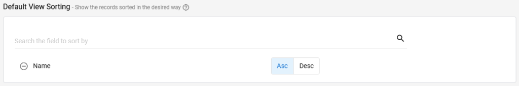
Ordenación de la vista por defecto
Una vista ordenada es simplemente una vista que ha sido ordenada: Sus registros están organizados en un orden definido en base a sus datos. Es muy similar a la ordenación de columnas en una hoja de cálculo.
La ordenación de la vista por defecto define cómo se ordenarán los registros de la vista cuando ésta se abra. Un usuario puede cambiar la ordenación de la vista haciendo clic en la cabecera de una columna, o haciendo clic en el icono de opciones de la vista en la cabecera de la vista. Sin embargo, al salir de la vista y volver a ella, la ordenación volverá a ser la definida en Ordenación de la vista por defecto.
| Artículo | Descripción |
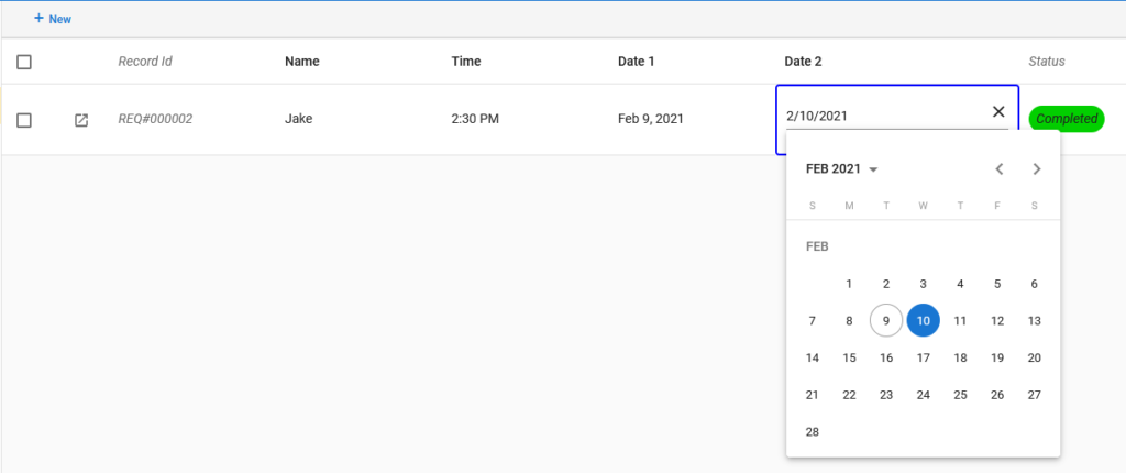
| Busque el campo para ordenar por | Al hacer clic en este campo aparece una lista desplegable de nombres de campos. Desplácese hacia arriba o hacia abajo en la lista para encontrar el campo deseado, o empiece a escribir el nombre del campo para filtrar la lista mostrada a los que coinciden con el carácter(es) que ha escrito. Seleccione el nombre del campo deseado una vez que lo vea en la lista. |
| Asc | Seleccione para definir el orden ascendente (A > Z) |
| Desc | Seleccione para definir el orden de clasificación descendente (Z > A) |
 | Haga clic en este icono para eliminar la condición de clasificación asociada. |
Agrupación de vistas por defecto
La agrupación de la vista por defecto define cómo se agruparán los registros de la vista cuando ésta se abra. Un usuario puede cambiar la agrupación de la vista haciendo clic en el icono de opciones de la vista en la cabecera de la misma. Sin embargo, al salir y volver a la vista, la agrupación volverá a ser la de la vista por defecto. (Véase el artículo Vistas: Una visión general para una explicación y un ejemplo de la agrupación de vistas).
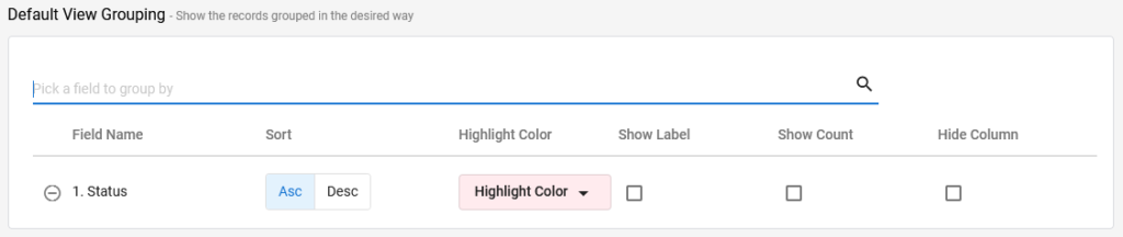
| Artículo | Descripción |
| Elija un campo para agrupar por | Al hacer clic en este campo aparece una lista desplegable de nombres de campos. Desplácese hacia arriba o hacia abajo en la lista para encontrar el campo deseado, o empiece a escribir el nombre del campo para filtrar la lista mostrada a los que coinciden con el carácter(es) que ha escrito. Seleccione el nombre del campo deseado una vez que lo vea en la lista. |
| Nombre del campo | Nombres de campos de agrupación ya seleccionados. |
| Asc | Seleccione para definir el orden ascendente (A > Z) |
| Desc | Seleccione para definir el orden de clasificación descendente (Z > A) |
| Color de realce | Seleccione el color deseado para usar en la fila del grupo. |
| Mostrar etiqueta | Muestra la etiqueta del campo (nombre) encima del valor en la fila del grupo. (Como normalmente se agrupa por valores que los usuarios reconocerían inmediatamente, como el departamento, el estado o el año, la opción "Mostrar etiqueta" no suele ser necesaria). |
| Mostrar el recuento | Muestra el número de registros en este grupo después del valor del grupo en la fila del grupo. Suele ser una información útil, por lo que se suele seleccionar. |
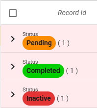
| Ocultar columna | Ocultará la columna del campo del cuerpo principal de la vista, sólo verá el valor de la columna en la fila del grupo. Por ejemplo, si se agrupa por estado y se selecciona "Ocultar columna", al expandir el grupo no se verá una columna separada para el estado en la vista (por lo que no se verá el valor del estado dos veces). |
| Haga clic en este icono para eliminar la condición de clasificación asociada. |
Campos de búsqueda
Los campos de búsqueda controlan los valores de los campos que se buscarán en esta vista. Si se deja vacía la sección Campos de búsqueda, GW Apps buscará en todos los valores de campo de los registros. Si se añade cualquier nombre de campo a la sección Campos de búsqueda vacía, se indicará a GW Apps que sólo busque en los valores de campo enumerados en los registros, y también cómo debe realizarse la comparación.
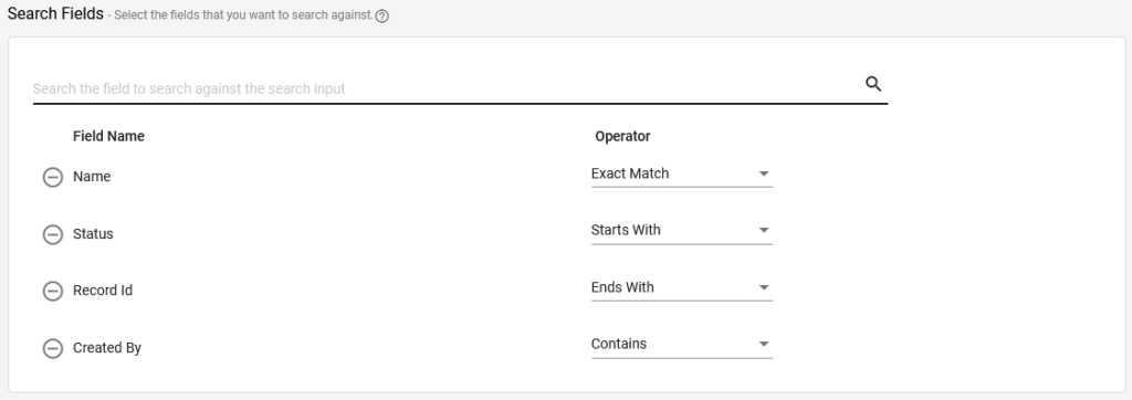
| Artículo | Descripción |
| Elija un campo para agrupar por | Al hacer clic en este campo aparece una lista desplegable de nombres de campos. Desplácese hacia arriba o hacia abajo en la lista para encontrar el campo deseado, o empiece a escribir el nombre del campo para filtrar la lista mostrada a los que coinciden con el carácter(es) que ha escrito. Seleccione el nombre del campo deseado una vez que lo vea en la lista. |
| Nombre del campo | Nombres de los campos seleccionados. |
| Operador | Define cómo se realizará la comparación de la búsqueda. Seleccione una de las siguientes opciones: - Coincidencia exacta - Sólo mostrará los registros con una coincidencia exacta en el campo asociado. Por ejemplo, en la imagen anterior he seleccionado el campo "Nombre" con el operador "Coincidencia exacta". Si busco "Jake", sólo se mostrarán los registros que tengan exactamente "Jake" en el campo nombre. Un registro con 'Jake C' en el campo nombre o 'Jak' no se mostraría. - Empieza por - Sólo mostrará los registros que empiecen por la entrada de búsqueda en el campo asociado. Por ejemplo, si utilizo el campo "Nombre" con este operador y escribo la letra "J" en la barra de búsqueda, sólo se mostrarán los registros con nombres que empiecen por "J", por lo que "Jake", "Jake C" y "Jeff" coincidirían, pero no "Fred". - Termina con - Similar a Empieza con, pero al revés: Sólo se mostrarán los registros que terminen con la entrada de búsqueda en el campo asociado. - Contiene - Sólo mostrará los registros que contengan la entrada de búsqueda en algún lugar del campo asociado. Así es como funciona la búsqueda si no se definen campos de búsqueda, el valor de búsqueda puede aparecer en cualquier lugar dentro de un archivo, pero ahora se aplica sólo al campo especificado. Así, la búsqueda de 'ake' coincidirá con 'Jake', 'Cake' o Handbrake', pero no con 'Jak' o 'Fish'. |
| Haga clic en este icono para eliminar la condición de clasificación asociada. |
Filtrado
Los filtros permiten restringir los registros que se muestran en la vista a sólo aquellos que coinciden con los criterios específicos, por ejemplo, sólo los registros en los que el campo Estado tiene el valor de 'Completado' y/o el campo Departamento tiene el valor de 'Ventas'. (Se puede aplicar más de un filtro a una vista).
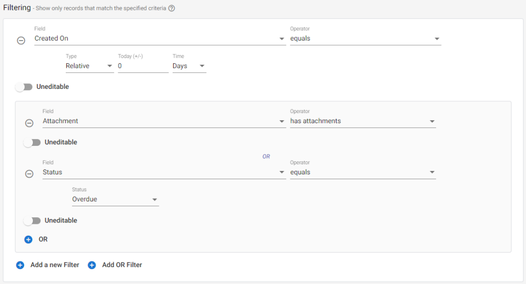
Hay dos tipos de filtrado:
| Artículo | Descripción |
| + Añadir un nuevo filtro | Al seleccionar esta opción se añadirá un filtro "Y", lo que significa que los registros deben cumplir todos los criterios especificados para ser visibles. |
| + Añadir filtro OR | Al seleccionar esta opción se añadirá un filtro "OR". Después de seleccionar esta opción, aparecerá un recuadro con fondo sombreado, y todo lo que se encuentre dentro de este recuadro se tratará como una condición "O". Con los filtros OR, los registros que cumplan una U otra de las condiciones serán visibles. |
Campo es el campo deseado para filtrar. (No todos los campos aparecerán en la lista. Los tipos de campos especiales, como el de texto enriquecido, no se mostrarán).
Las opciones del operador son sensibles al contexto del tipo de campo seleccionado. Las opciones incluyen:
| Texto Campo | Numérico Campo | Tiempo Campo | Fecha Campo | Recogedor de la unidad / Accesorio | Creado por / Actualizado por | Estado |
| es igual a | mayor que | es igual a | antes de | tiene accesorios | es igual a | es igual a |
| no es igual a | menos de | no es igual | después de | no tiene accesorios | fue | |
| en blanco | menor o igual a | después de | es igual a | |||
| no en blanco | mayor o igual que | antes de | ||||
| contiene | es igual a | en blanco | ||||
| no contiene | no es igual | no en blanco |
El valor es el valor con el que se compara el campo. Esto también es sensible al contexto del tipo de campo seleccionado:
- Los campos de texto o de lista requerirán una entrada de texto.
- Los campos de fecha requerirán que elija un tipo: Fijo o Relativo. El fijo tiene un selector de fecha; el relativo se calcula sumando los valores del día, mes o año a la fecha actual. Un cero significaría que sólo se mostrarían los registros creados hoy (demostrado en la imagen de arriba), y un número negativo significaría que sólo se mostrarían los registros creados 'X' Días/Meses/Años en el pasado.
- Los campos numéricos requerirán una entrada numérica.
- Los campos de estado tendrán una lista desplegable con las etapas del flujo de trabajo (puede seleccionar varias).
No editable hace que el filtro sea una parte fija del diseño de la vista. Si está desactivado, el usuario de la aplicación podrá anular el filtro mientras utiliza la aplicación. Si está activado, el usuario podrá aplicar filtros adicionales, pero no eliminar éste.
 | Seleccione este icono para eliminar un filtro. |
Exportaciones
Puede controlar qué opciones de exportación permitir para cada una de sus vistas.
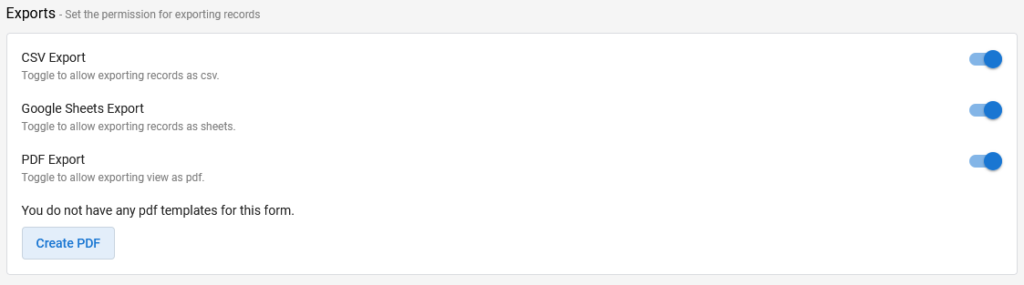
La Exportación de PDF, cuando se activa, requerirá que usted seleccione (o cree si no tiene una todavía) una Plantilla de PDF.
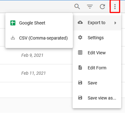
Para exportar desde una vista, seleccione los tres puntos de la esquina superior derecha de la vista.
Seguridad
La seguridad determina quién tiene permiso para ver la vista.
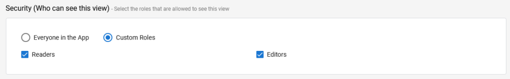
| Artículo | Descripción |
| Todos en la aplicación | Todos los que tienen acceso a la aplicación, es decir, su nombre aparece en uno de los roles definidos en la aplicación. |
| Roles personalizados | Al seleccionar "Roles personalizados" se muestran casillas de verificación para cada rol definido en la aplicación. Puede seleccionar los roles que deben tener acceso. Si no se selecciona ningún rol, nadie podrá ver la vista. |
Vídeo de demostración
En el siguiente vídeo se describe la creación de vistas:
Próximos pasos
| A continuación hay enlaces a artículos que cubren los detalles de los 3 tipos de vistas, y otro sobre cómo ajustar el diseño de una vista mientras se mira, utilizando la edición en la vista: |
| Editor de vistas: Vistas de tabla |
| Ver Editor: Vistas del calendario |
| Editor de vistas: Vistas Kanban |
| Vistas: En la edición de vistas |
| A continuación se encuentra el enlace a la parte de construcción de la vista de la serie de tutoriales sobre la construcción de una aplicación de informes de gastos: |
| Parte 7 - Vistas |